Why Some Doors Look Calm
A car's side profile says a lot about its design. From across a parking lot, a few well-placed lines can make a car look sleek and balanced, while too many creases can make even a good-looking shape seem cluttered. Some designers let the proportions do most of the work, while others add sharp angles and sculpted panels to draw attention. The results aren't always flattering. Here are 10 cars that prove a clean side profile works and 10 that could have done with fewer creases.
1. The Fiat Panda Uses Flat Glass
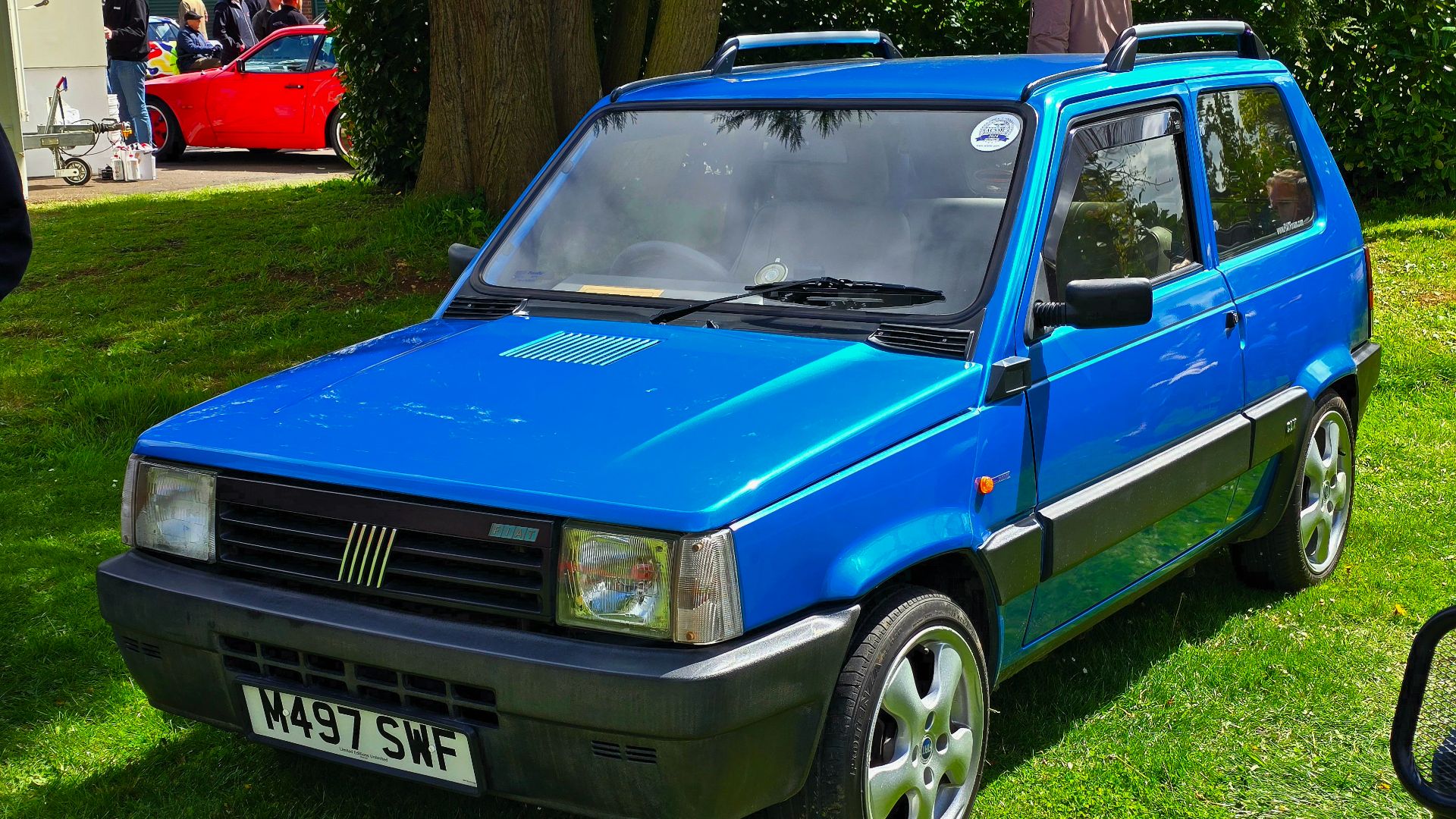
When Giorgetto Giugiaro designed the 1980 Fiat Panda, he used flat glass for every window to keep production costs down. The flat windows matched the simple body panels, while recessed door handles kept anything from sticking out. The result was a clean, boxy profile with almost no unnecessary details. What began as a cost-saving measure became one of the car's defining design features.
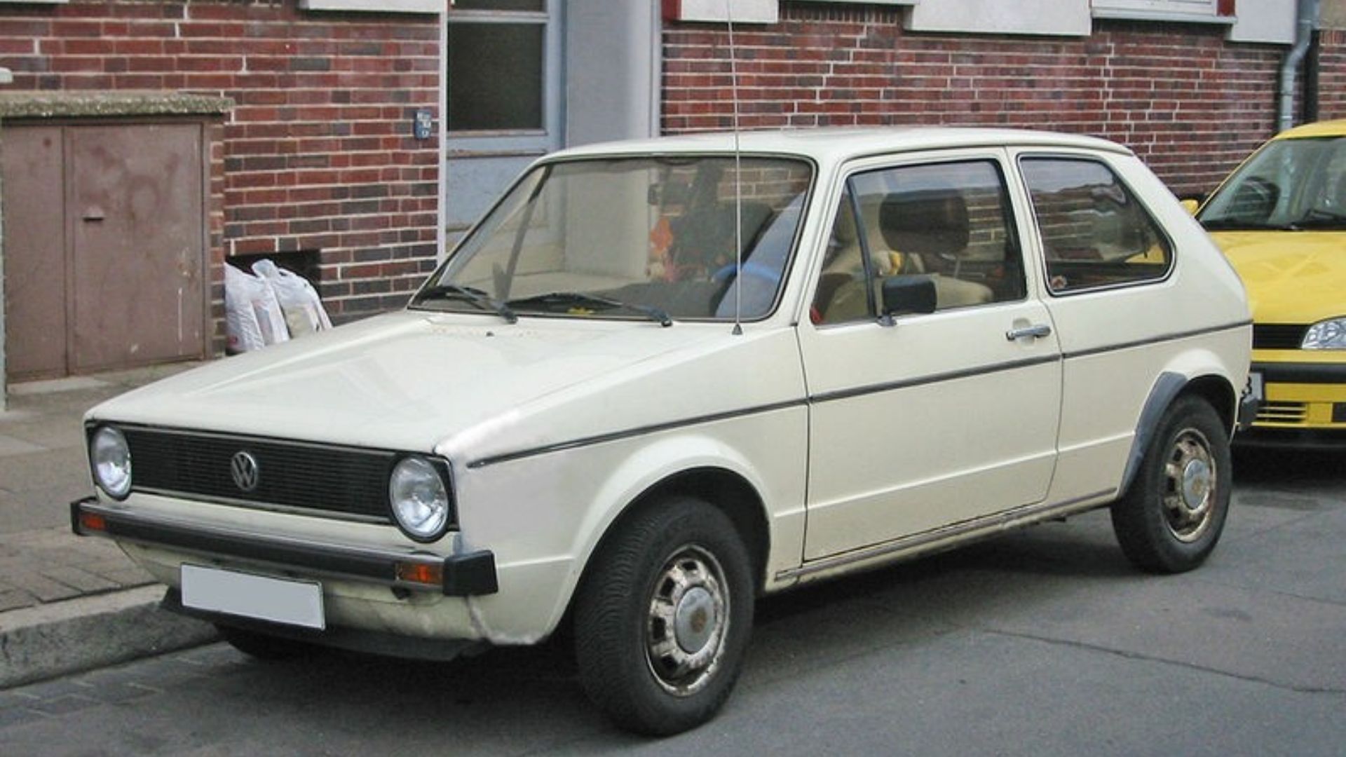
2. The Golf Mk1 Folds Its Panels
Flat planes and crisp edges give the 1974 Volkswagen Golf a shape often described as folded paper. Few corners break up the surfaces, so a strong C-pillar carries most of the visual interest. That pillar remains a recognizable Golf feature today.
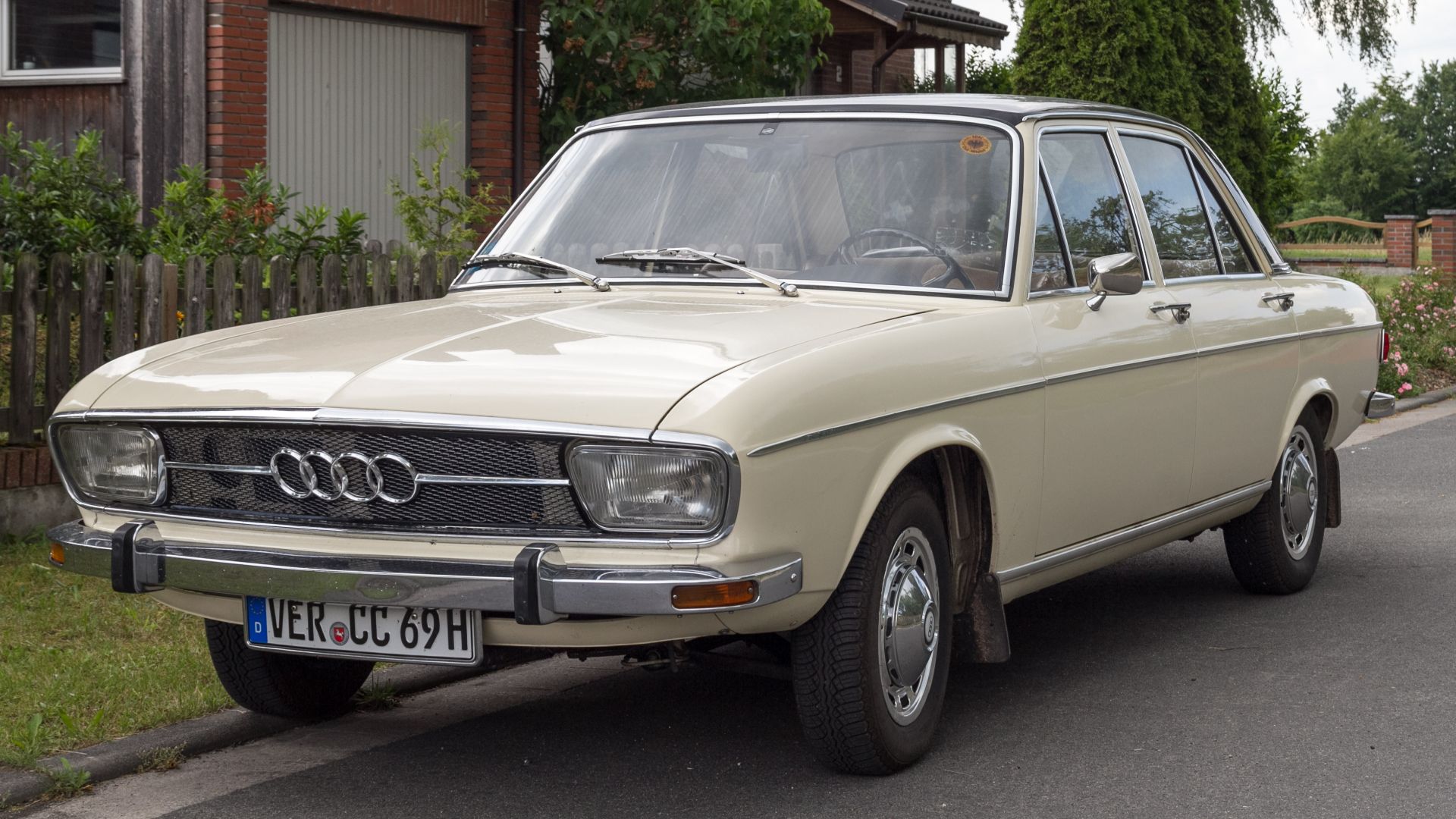
3. The Audi 100 Sits Flush
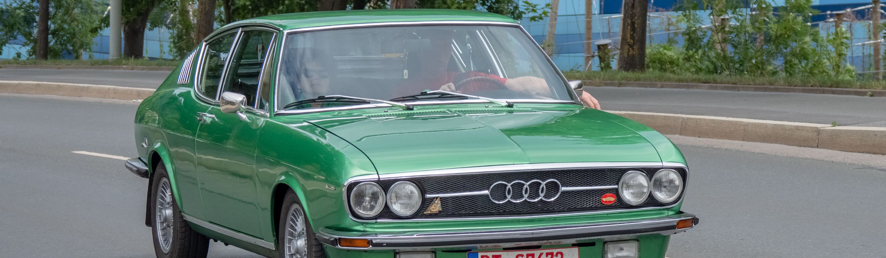
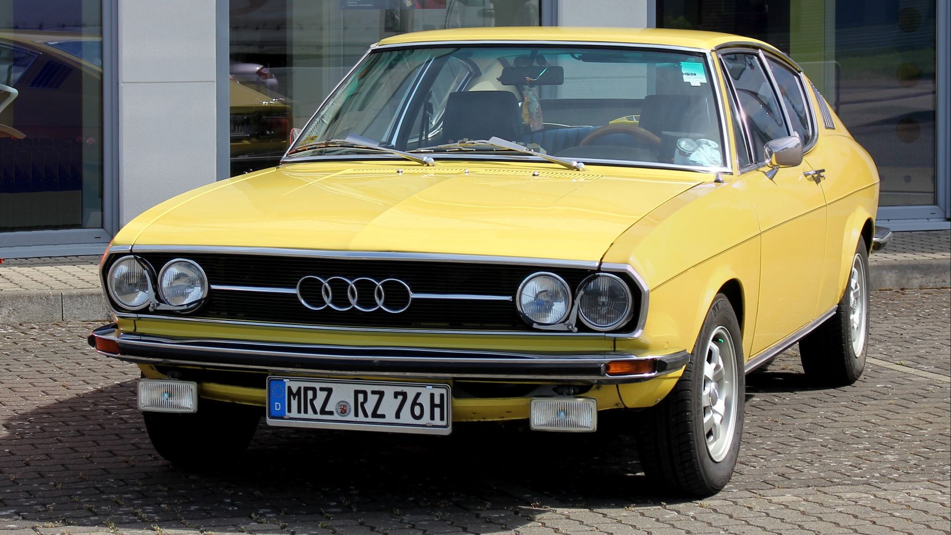
Audi set the side windows of the 1982 100 flush with the body, and the smoothest version reached a drag coefficient of 0.30. Window recesses add drag and also break up the surface, so closing them helped efficiency and appearance at once. The glass reads as part of the same skin as the doors.
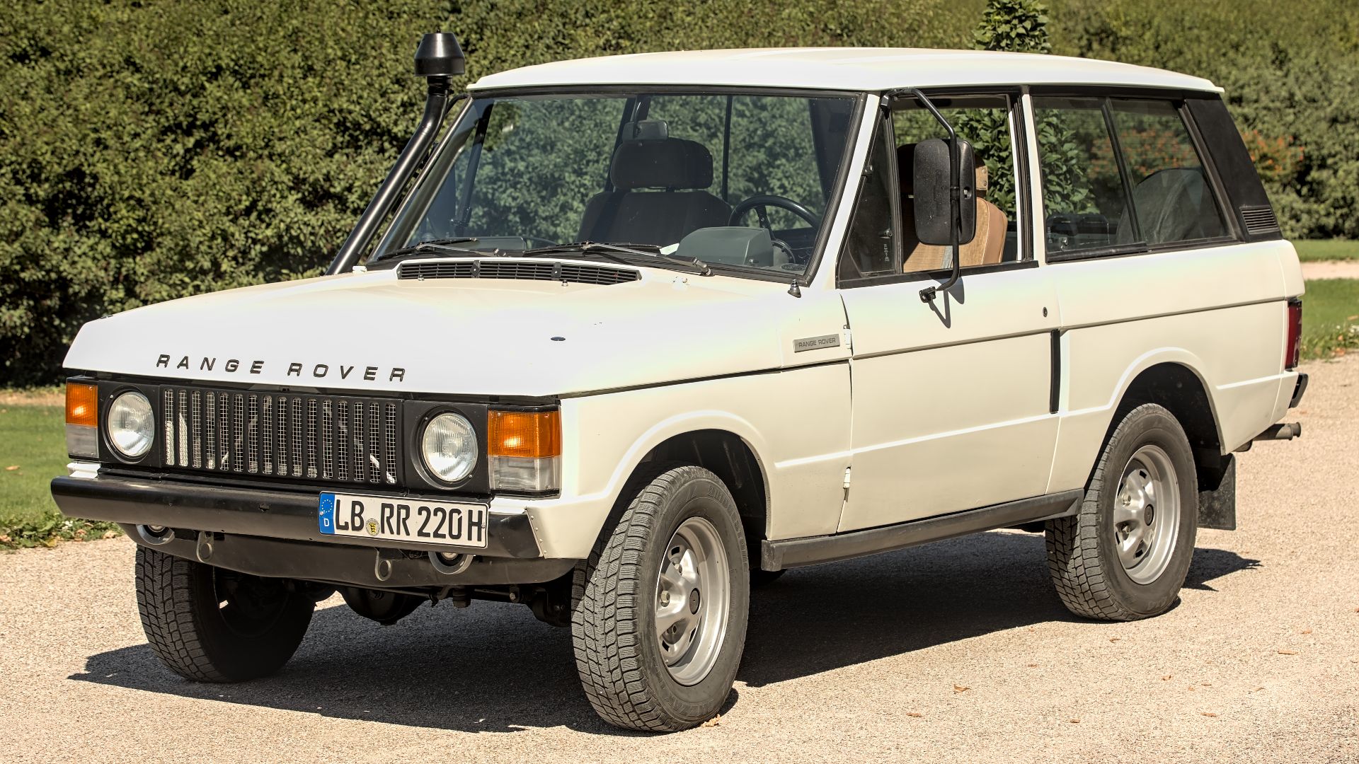
4. The Range Rover Kept an Engineer's Shape
Engineer Spen King sketched the 1970 Range Rover, and stylist David Bache changed little beyond the grille and headlights. The sides stay plain apart from one indentation, and a Range Rover appeared at the Louvre in 1971 as an exemplary work of industrial design.
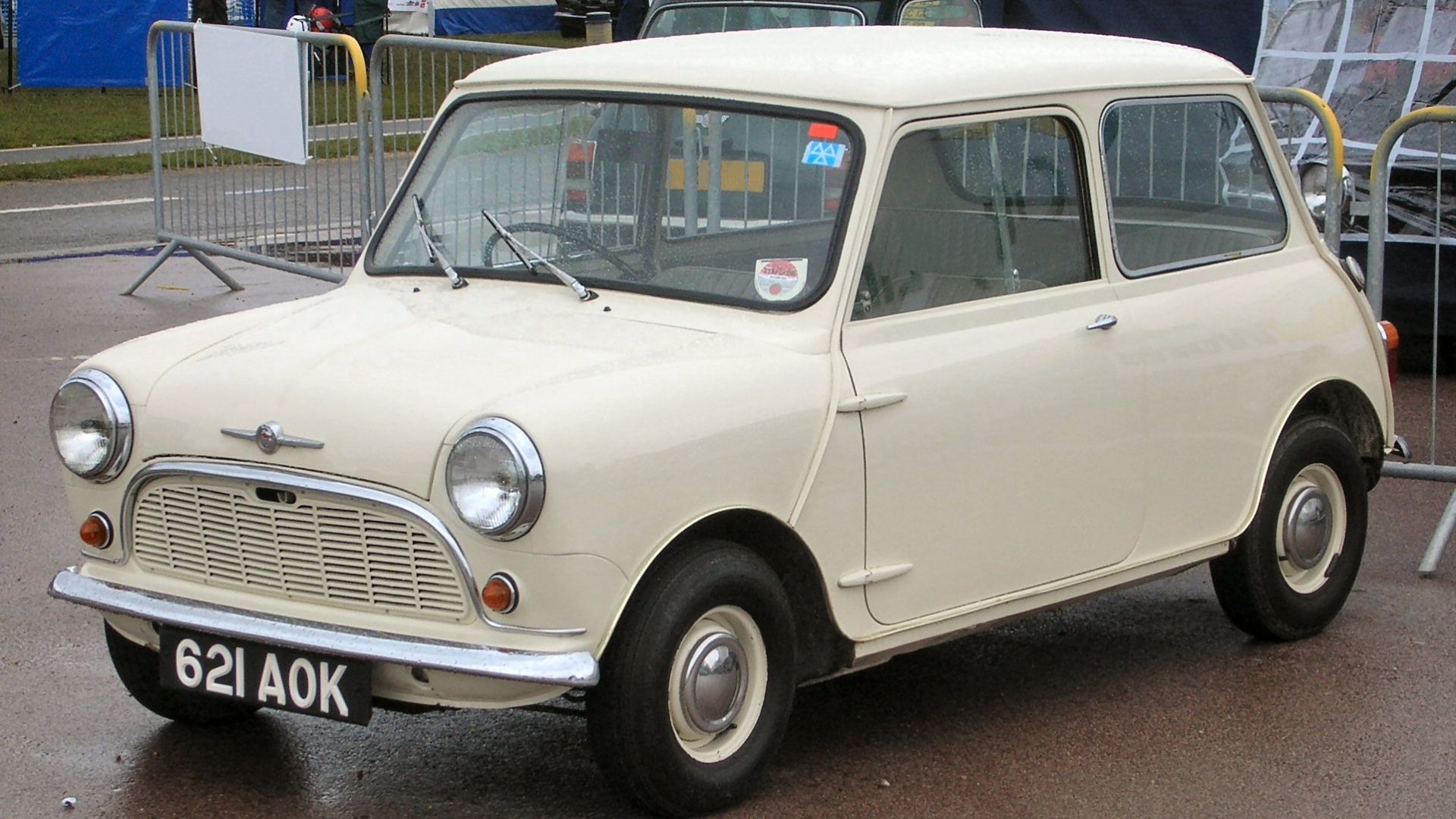
5. The Mini Was Drawn Around a Box
Alec Issigonis designed the 1959 Mini to fit a box ten feet long, with at least 80 percent of the space reserved for passengers and luggage. He held that a car should take its shape from its engineering, and the packaging left little room for extra detail. The small body keeps its sides smooth from the front wheel to the rear.
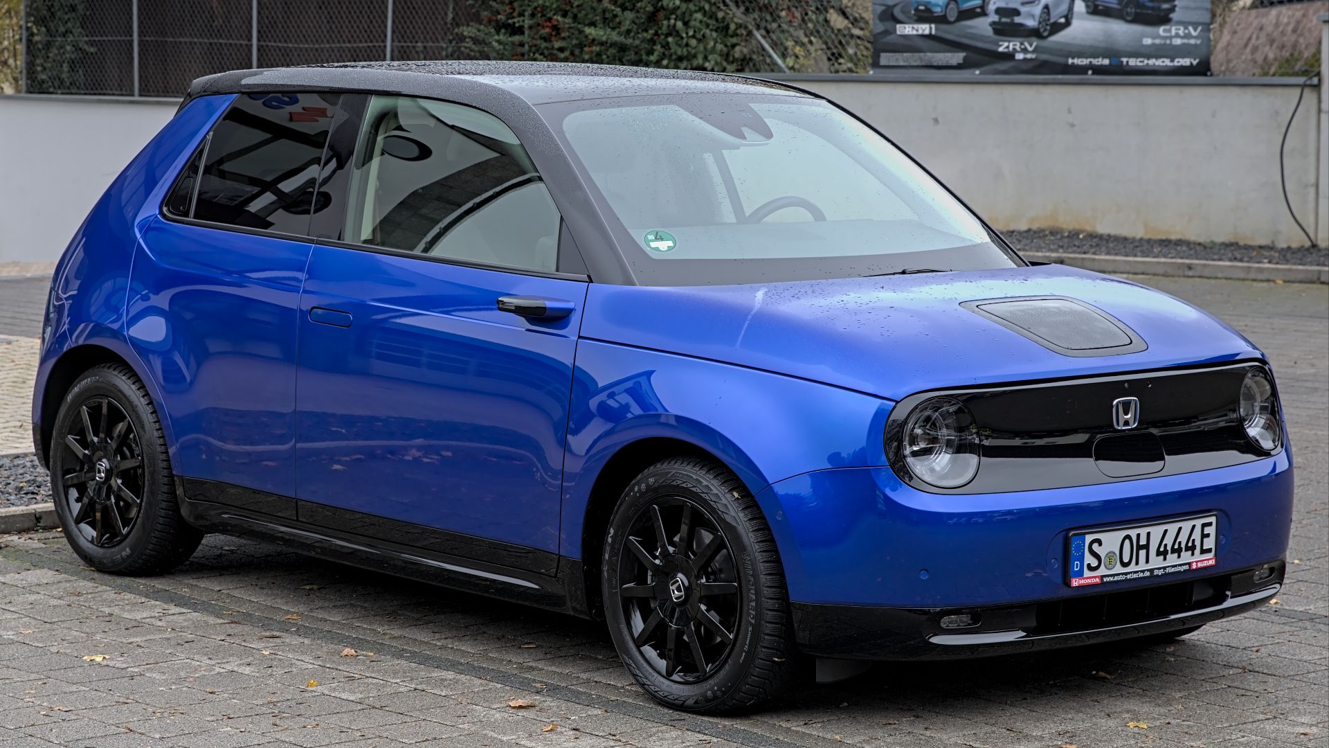
6. The Honda e Removes Its Mirrors
Honda replaced the mirrors on the e with small cameras, and the company says that removes the channel lines normally needed to move air and rain off the side. Door handles pop out only when the driver approaches. The hood's shut line carries back along the body and climbs the C-pillar as the car's most visible body line.
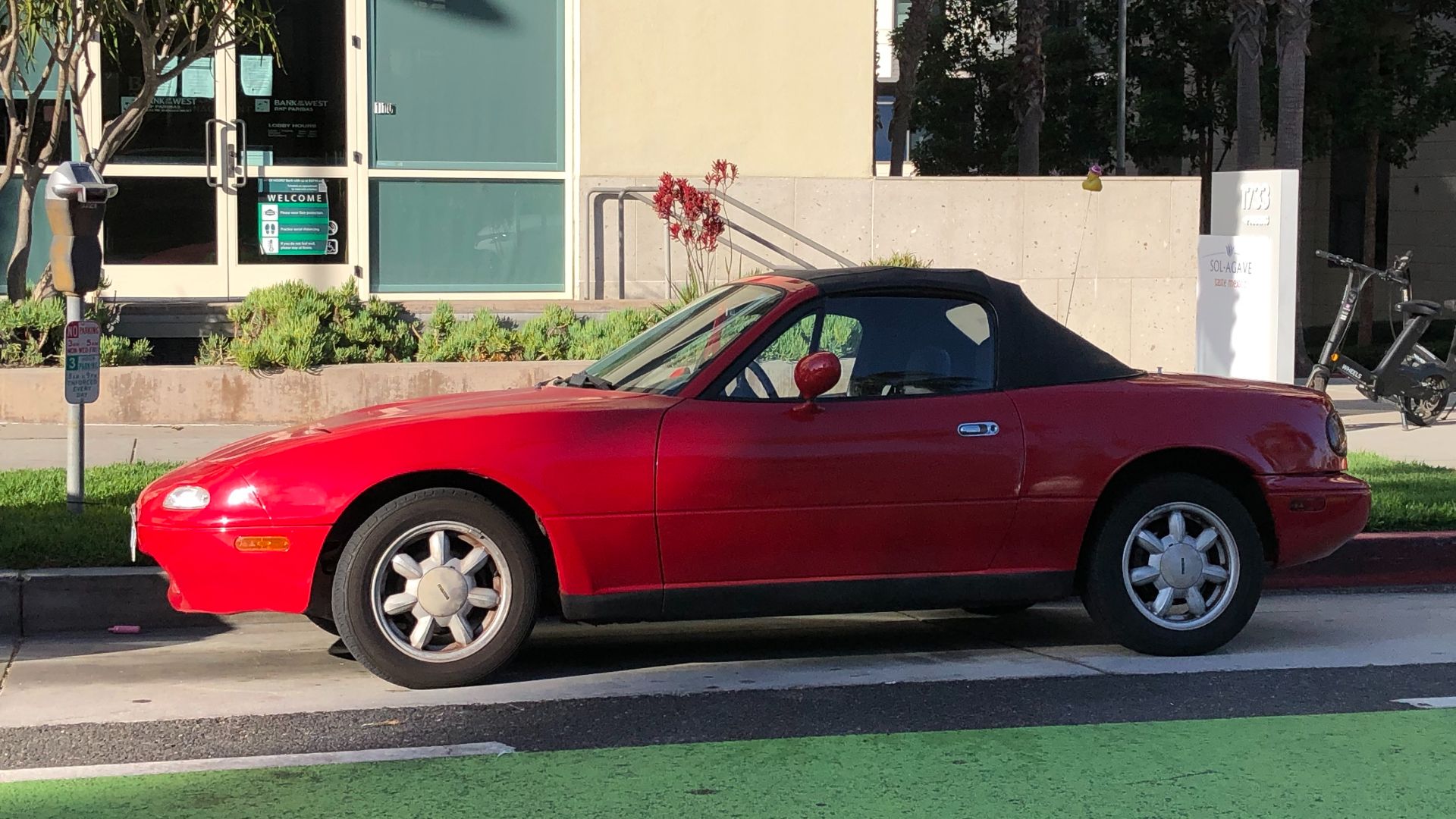
7. The MX-5 Aims for Light and Lean
Designer Mark Jordan wrote that the 1989 Mazda MX-5 had to look minimalist and lightweight while also wearing well for at least ten years. Pop-up headlights tend to let a nose sit low and smooth, so the front fenders need little else to define them. A soft shoulder line runs back toward the tail.
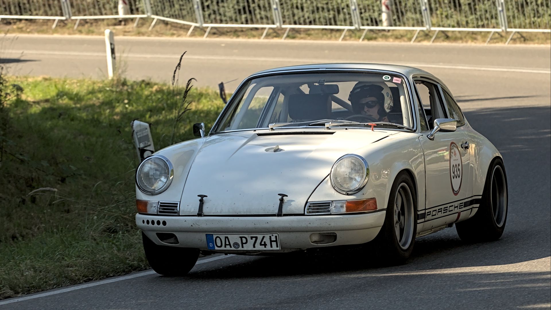
8. The 911 Uses One Long Line
Ferdinand Alexander Porsche drew the 911 for its 1963 debut as the 901. A single line follows the fenders through the doors and into the rear quarter windows before the roof slopes toward the tail. Porsche has kept that silhouette close to the original for decades, with each update adjusting details around the same main shape.
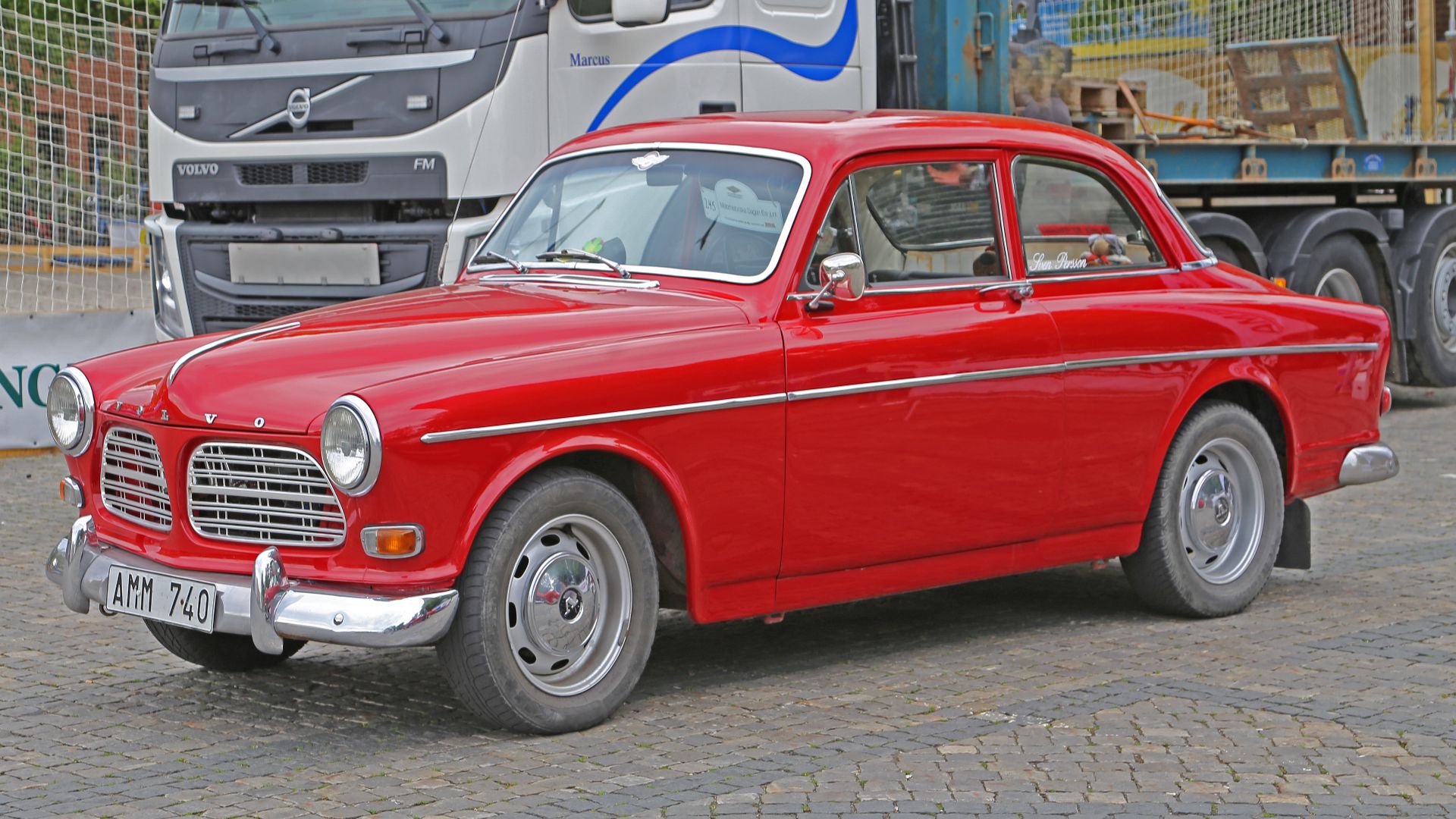
9. The Volvo Amazon Skips Separate Fenders
Jan Wilsgaard was 26 when he drew the 1956 Volvo Amazon, the company's first ponton body. Ponton styling removes the separate fenders and running boards of older cars, so the side reads as one surface from front to back. Broad rounded shoulders and slight tail fins add shape without adding extra lines.
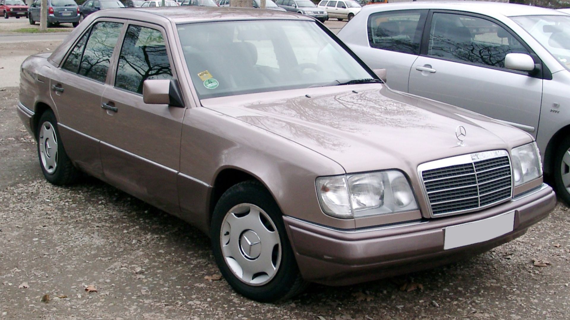
10. The Mercedes W124 Fits Its Panels Closely
Under design chief Bruno Sacco, the 1984 Mercedes W124 got flush glass and narrow seams between panels. The saloon reached a drag coefficient of about 0.29, and some versions went lower. The slightly wedged profile and high trunk lid carry the shape, so the doors need no extra lines.
Now, here's 10 cars whose flanks carry a lot of extra detail.
1. The Prius Adds Two Long Creases
Toyota gave the 2016 Prius a line above the sill that sweeps up toward the rear fender and an upper crease that turns into the rear spoiler. An earlier softer proposal was reportedly overruled for looking too organic, and the sharper version went to production. When two long lines share one flank, the eye has to sort several shapes at once.
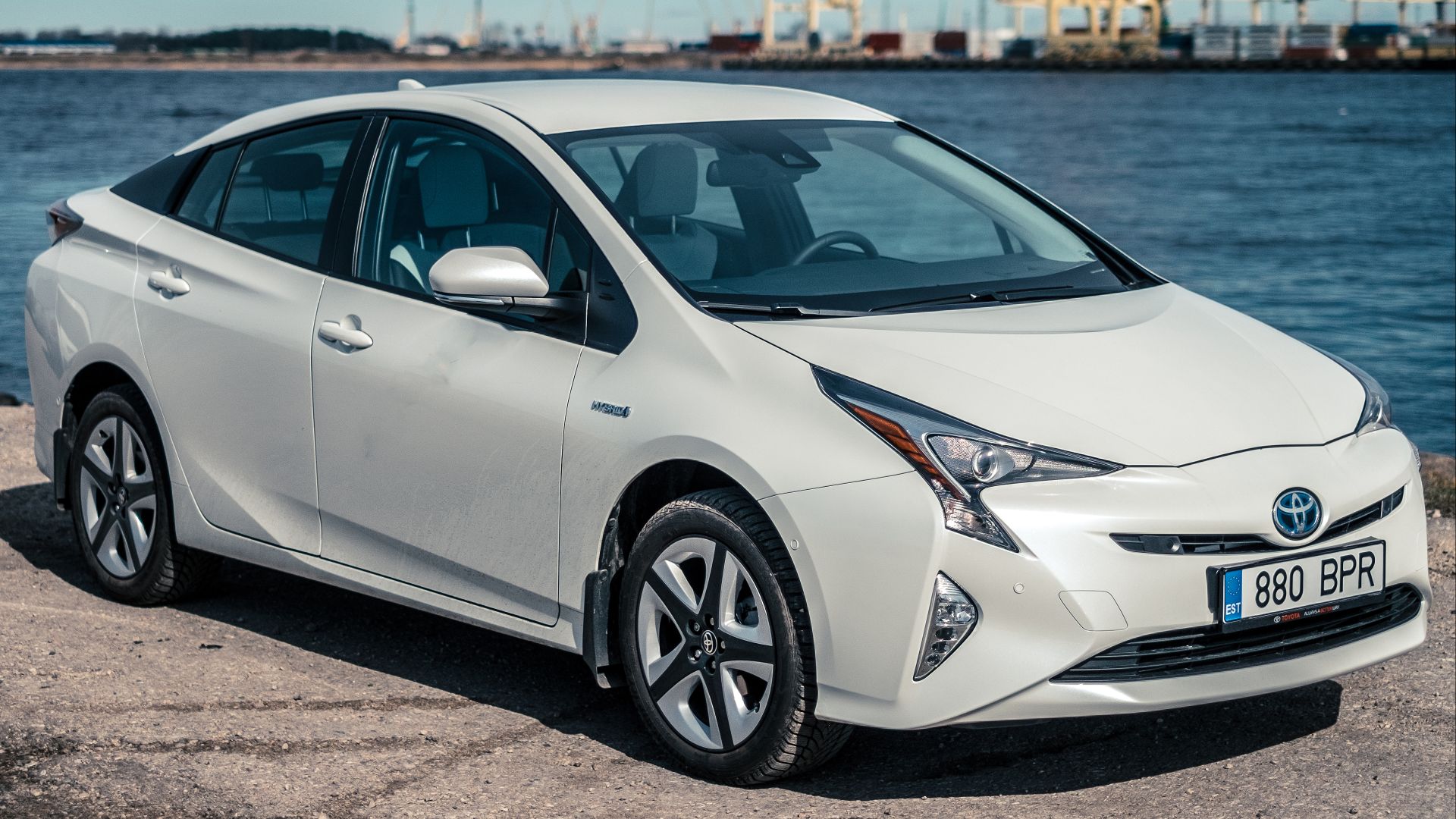 Kārlis Dambrāns from Latvia on Wikimedia
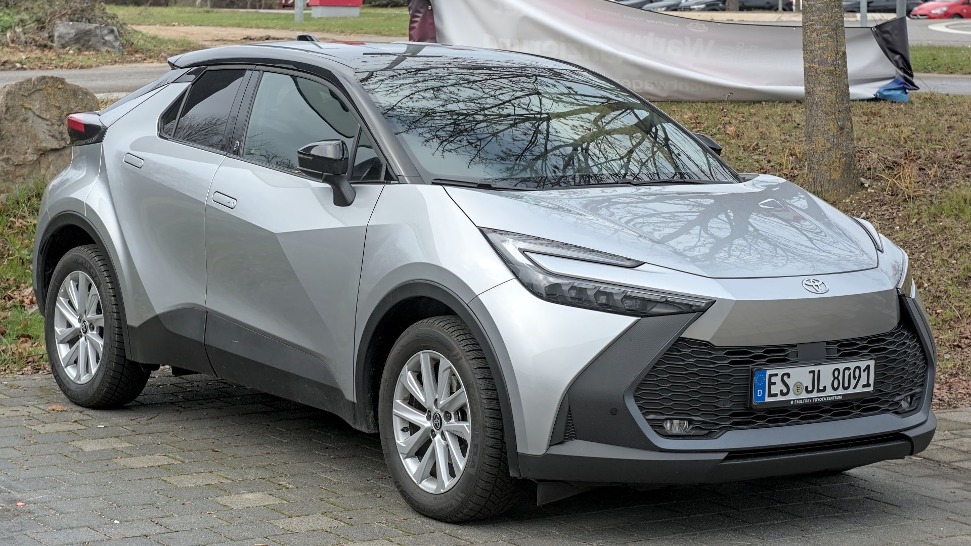
2. The C-HR Builds on a Diamond Theme
Toyota based the 2016 C-HR on a diamond theme, with faceted surfaces shaped like a cut gemstone. Wheel arches that project at all four corners and a pinched waist add more shapes to the body. Each facet catches light at a different angle, and that tends to make the flank look busy from a distance.
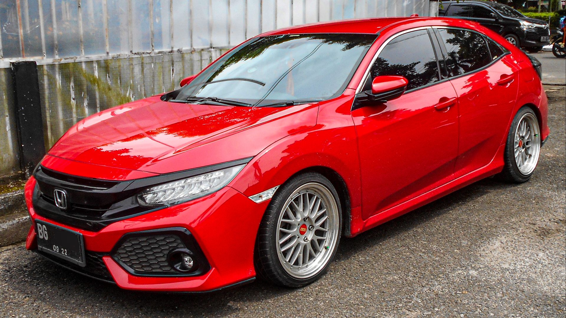
3. The Civic Adds Sharp Hood Lines
The 10th-generation Honda Civic of 2016 added sharp lines across the hood and pronounced air intakes at both ends. Honda called it the sportiest Civic design in the brand's history, and sportier looks usually mean more edges. Some reviewers described the result as busy because so many styling cues sit within a compact sedan's length.
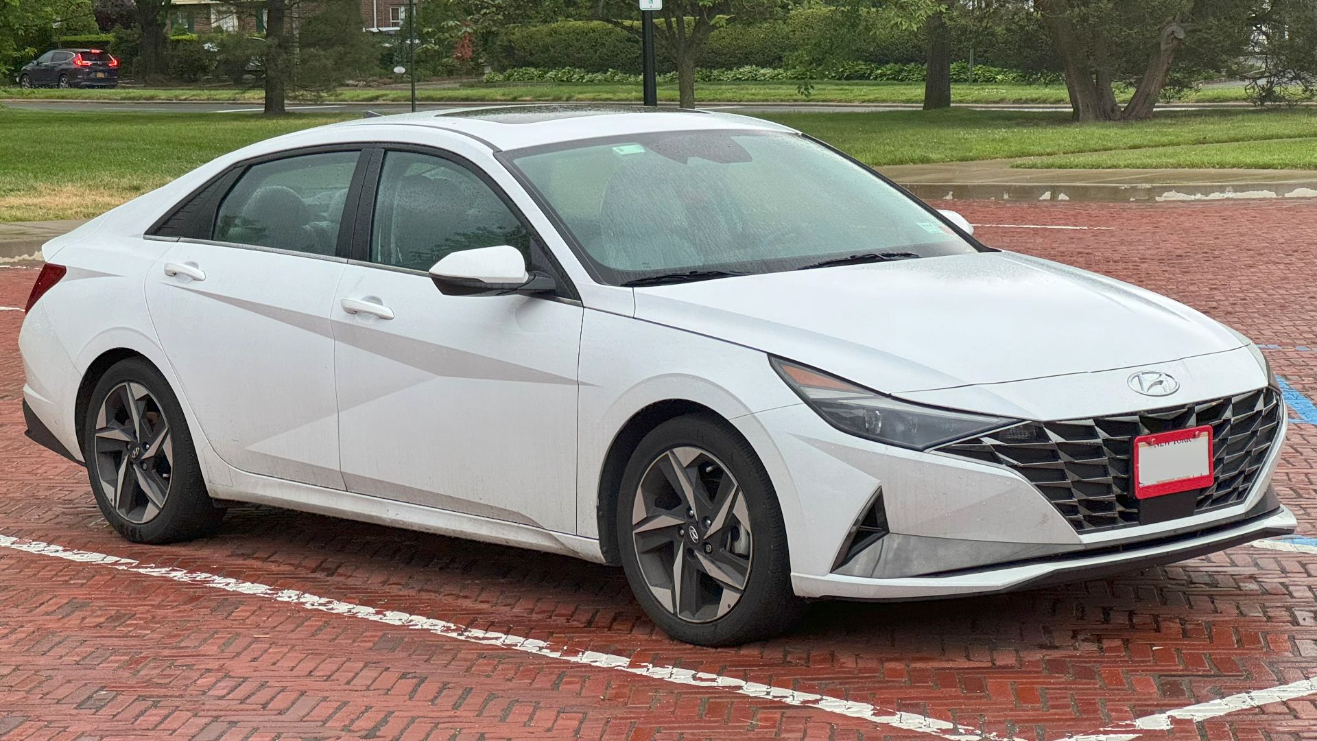
4. The Elantra Joins Three Lines at One Point
Hyundai designed the 2021 Elantra around a theme called parametric dynamics, where three body lines meet at a single point. Hyundai said that arrangement had been avoided in car design. Several lines zigzag across each door in a backward Z, and the flank offers many turning points for the eye to follow.
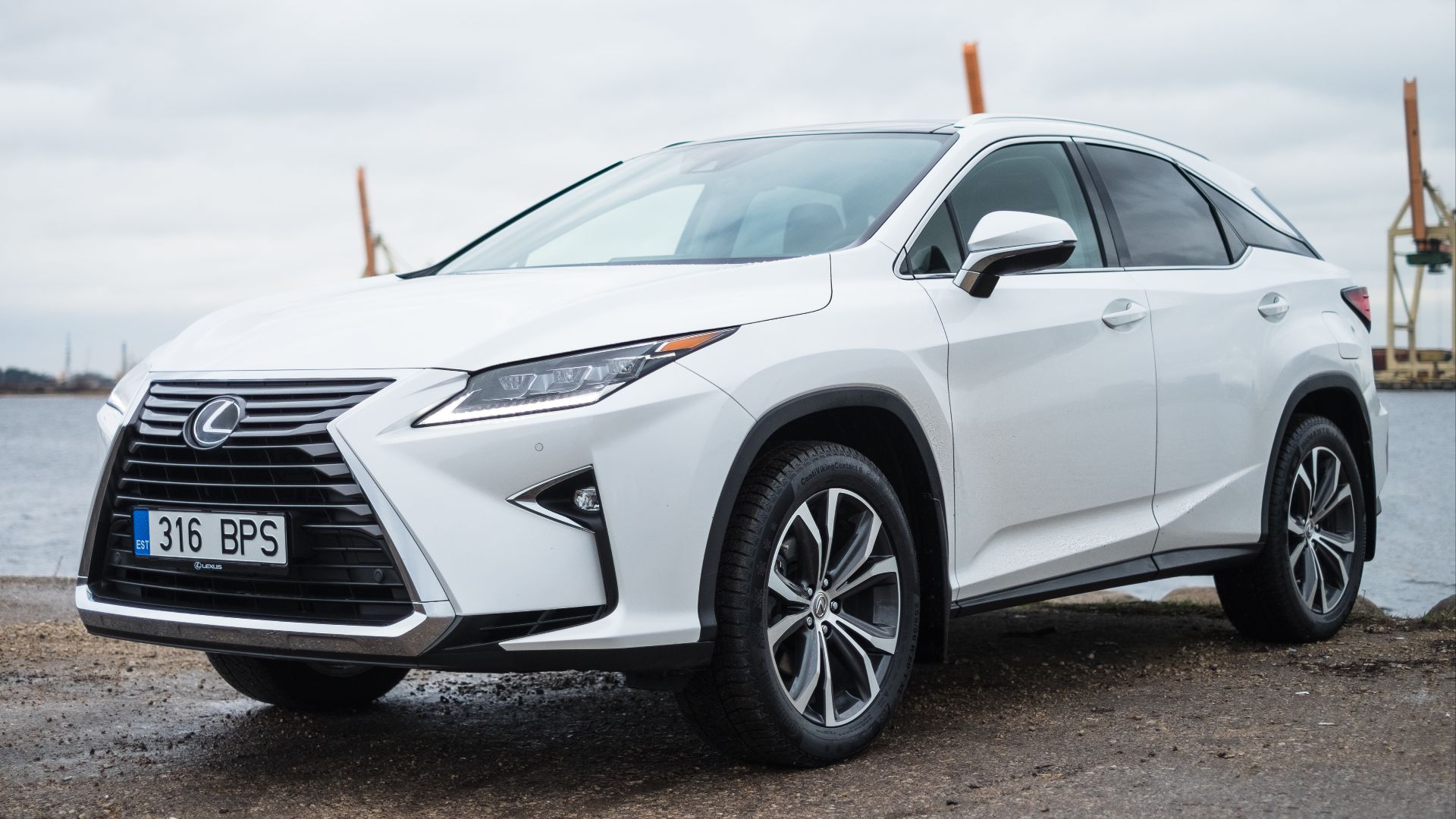
5. The Lexus RX Carries Its Grille Shape Back
Lexus described the 2016 RX as a mix of sharp creases and curves, and the spindle shape from the grille returns in the rear styling. Angular slashes cut across the sides of a tall body with a lot of surface to fill. Some reviewers found the flanks too busy, and others read the same lines as confident styling.
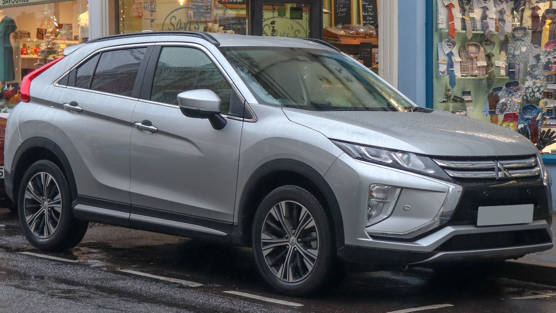
6. The Eclipse Cross Splits Its Rear Glass
The 2018 Mitsubishi Eclipse Cross has a wedge profile with a crease that starts at the front doors and runs back to the tail lamps. A deeply raked rear window is divided by a horizontal light band, so the back carries another set of lines. Mitsubishi's 2022 refresh swapped the split glass for a single-piece rear window and a more conventional hatch.
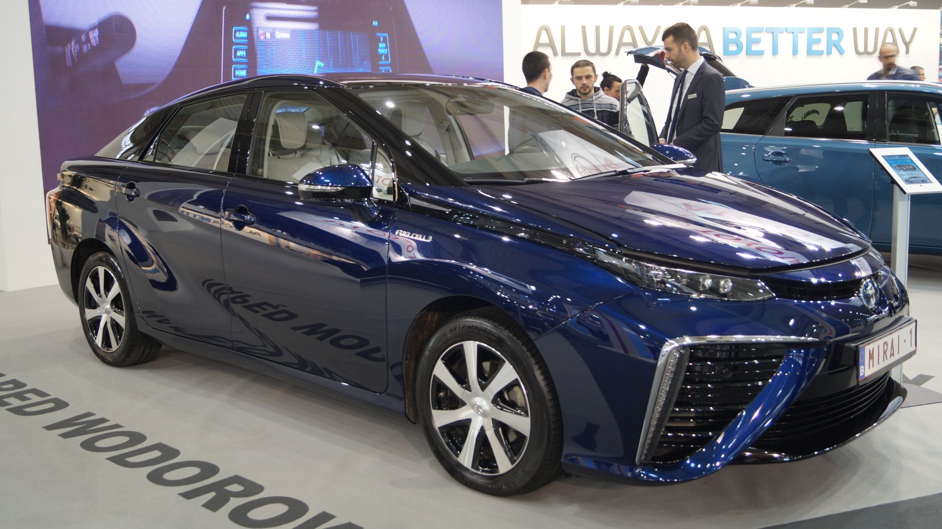
7. The Mirai Fills Its Front With Vents
Large front vents and a sharply defined hood line dominate the 2016 Toyota Mirai, and reviewers widely called its styling polarizing. Big openings leave less plain surface near the nose. The hood line adds a hard edge above them.
8. The 2012 A-Class Pressed In Creases
Mercedes launched the 2012 A-Class with creases and recesses pressed into the sheet metal. Design chief Gorden Wagener later said the time of creases was over, and he added that the earlier car influenced mainstream design by adding lines. The 2018 model removed most of the side lines that the first car had.

9. The WRX Adds Black Cladding
Dark plastic cladding wraps all four wheel arches and the sills on the 2022 Subaru WRX. The cladding does protect the arches from stone chips, and it also divides the body into a painted upper half and a black lower edge. One road test noted that it can distract from the shape on a bright color such as orange.
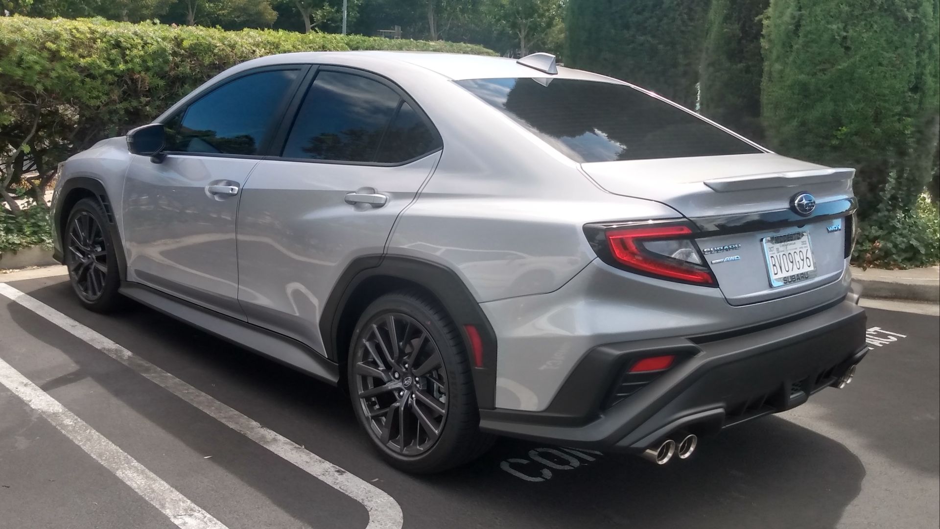 DestinationFearFan on Wikimedia
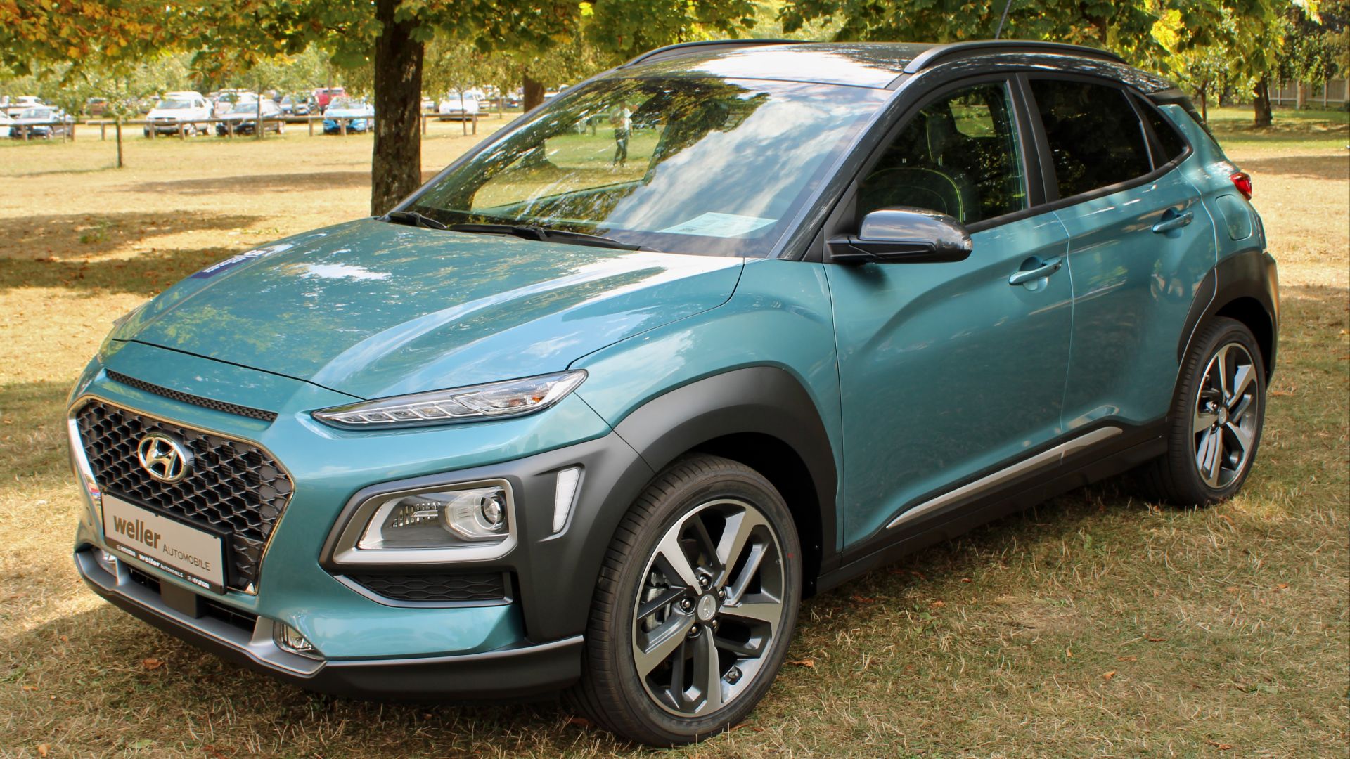
10. The Kona Splits Its Lights and Body
Hyundai calls the black cladding on the 2018 Kona its armor, and it covers the wheel arches and runs into both bumpers. A plastic insert on the C-pillar and split lighting at both ends add more separate pieces. Some reviewers found the result fussy at first glance.