
Evolving Vs Enduring
Car badges tell stories that most people barely notice. Certain manufacturers treat their logos like rough drafts, with repeated changes throughout the years. Then come others who make minimal adjustments to their original designs, polishing rather than replacing what works perfectly fine. Let's look at both sides!
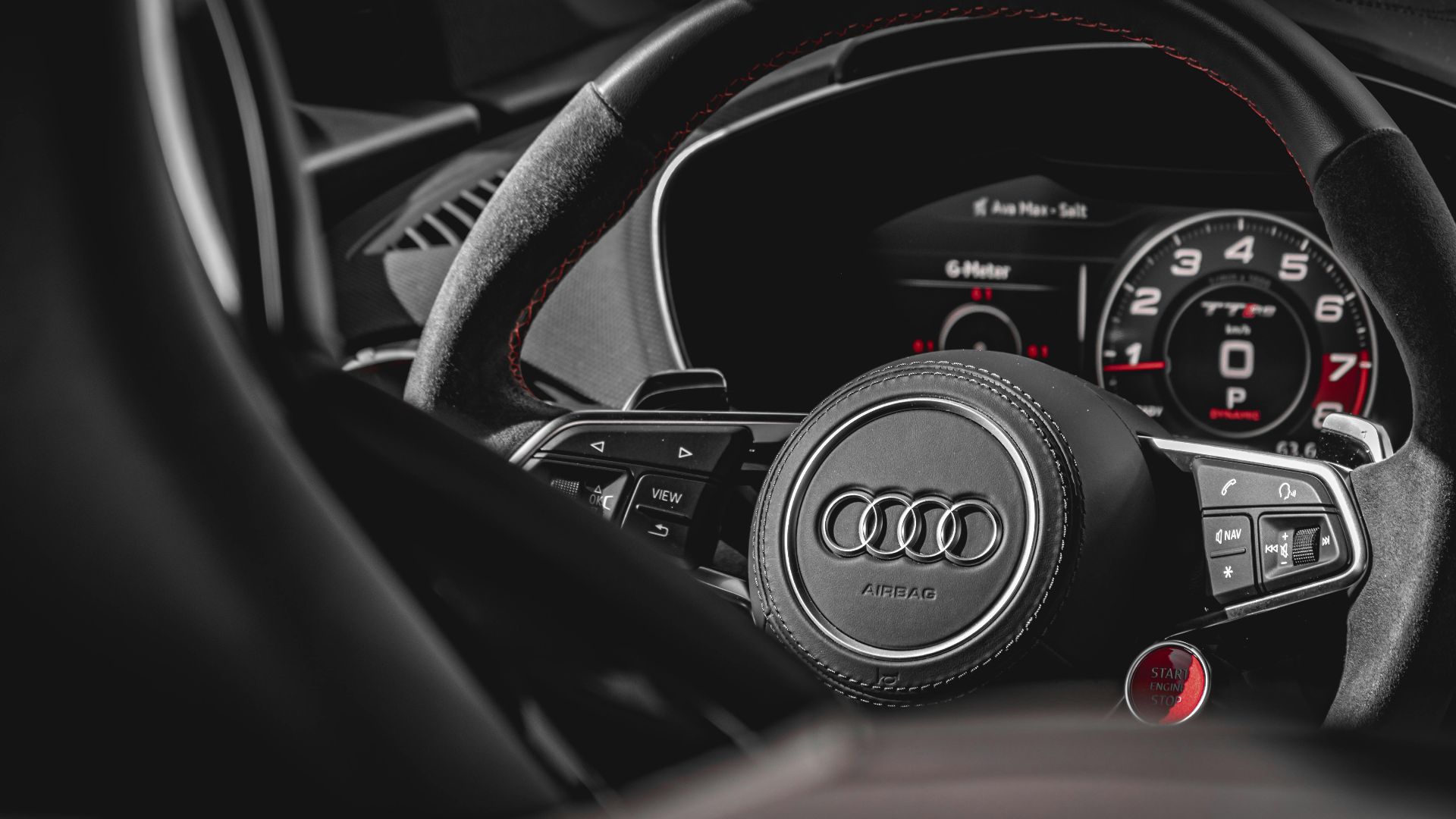
1. Audi
Four rings weren't always Audi's symbol. The logo disappeared in 1969, replaced by a simple oval reading "Audi." From the original 1932 interlocked rings representing four merged companies, through various dimensional treatments, to today's flat minimalist design, Audi's emblem has changed a lot.
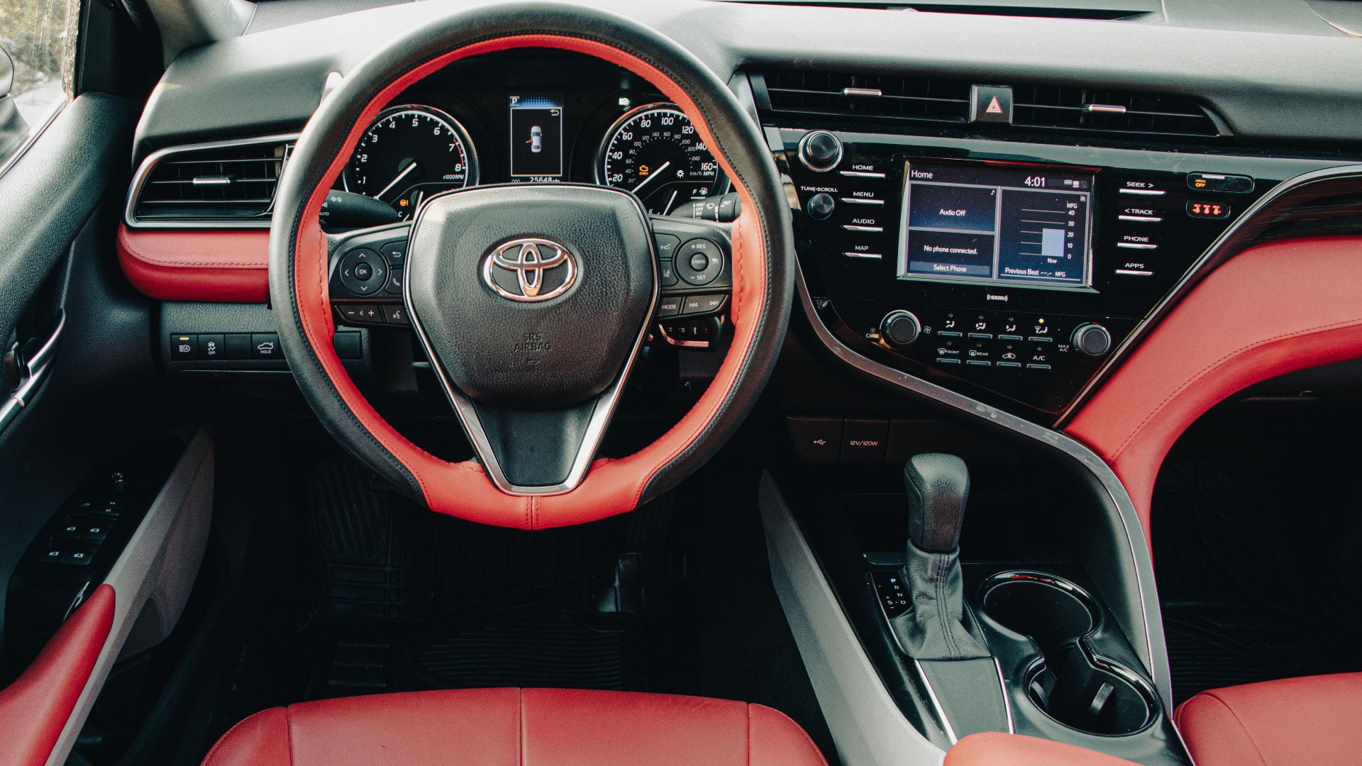
2. Toyota
"Toyoda" was the original name, honoring founder Kiichiro Toyoda, but the company transitioned to "Toyota" in 1936 for easier international pronunciation. The current three-oval layout from 1990 witnessed changes in 2020 (region-specific), losing all metallic finishes, embossed elements, and dimensional effects.
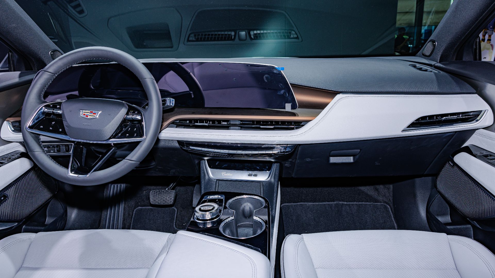
3. Cadillac
Luxury demands perfection, but Cadillac's logo tells a story of constant refinement. Based on Antoine de la Mothe Cadillac's coat of arms, it has been redesigned over 30 times since 1902. Early versions displayed elaborate crowns, mythical birds called merlettes, and ornate wreaths.
4. Nissan
When Nissan filed trademarks for its new flat design logo, it joined the automotive industry's rush toward digital-friendly branding. Nissan's recent emblem redesign eliminated decades of chrome treatments and dimensional effects. The digital-friendly graphics represent their shift from conventional automaker to mobility provider.

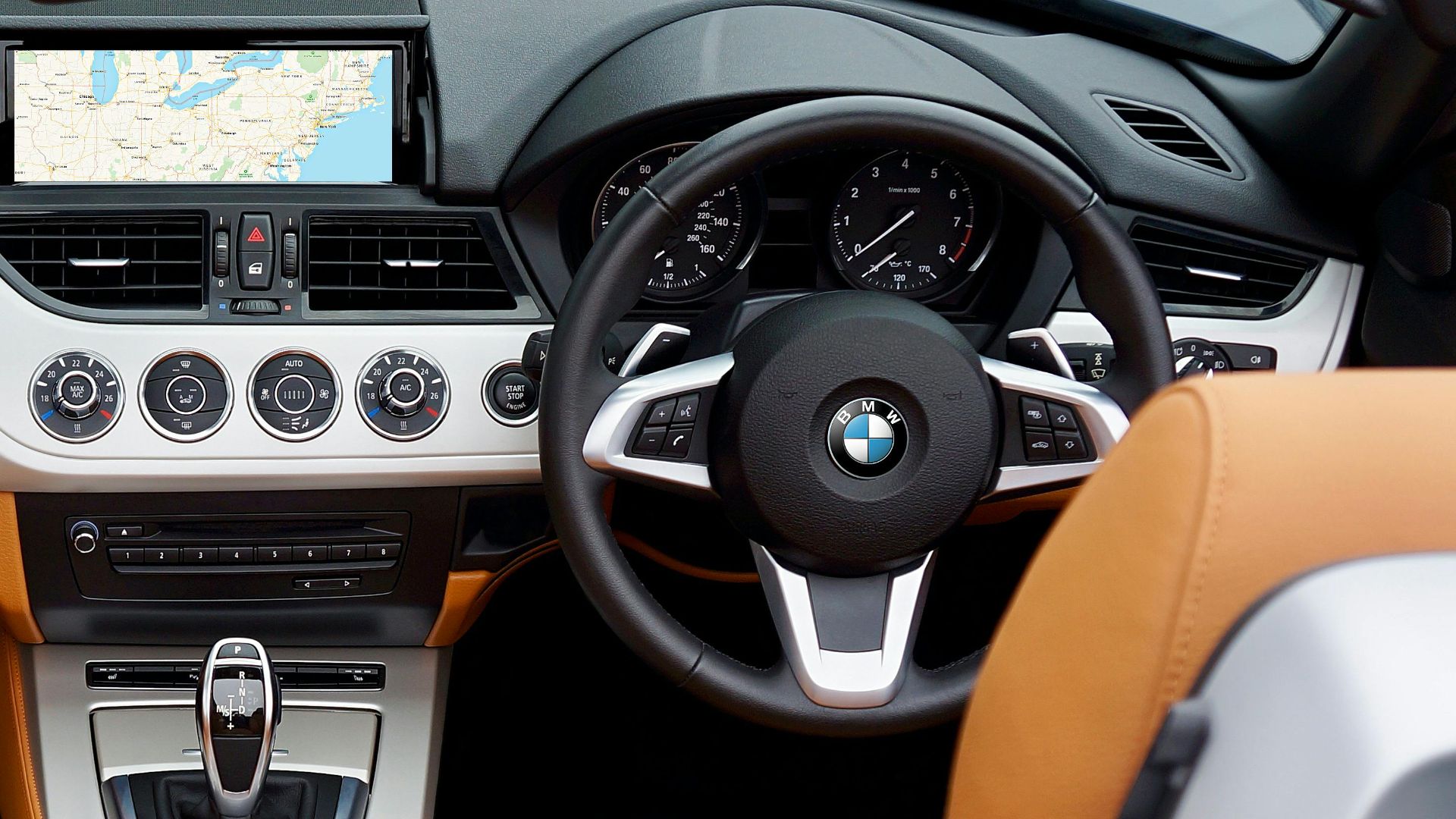
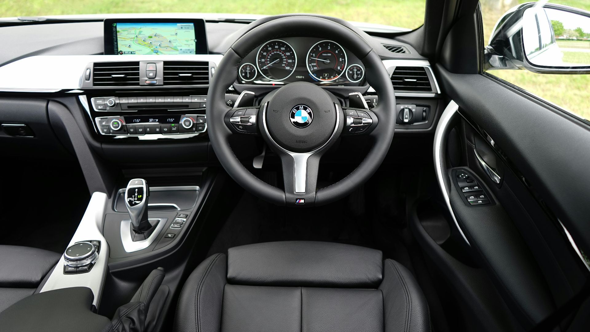
5. BMW
Originally designed in 1917 with Bavarian colours set against a black background, BMW's roundel has undergone several transformations. The 1960s brought sharper contours and sans-serif typography, while recent years saw the controversial removal of the black ring beneath the lettering.
6. Volkswagen
VW's logo went from a complex 1937 design featuring gear teeth and propeller-like elements to a clean symbol. The most dramatic change came in 2019 when the "W" stopped connecting to the circle's bottom edge for the first time in history.

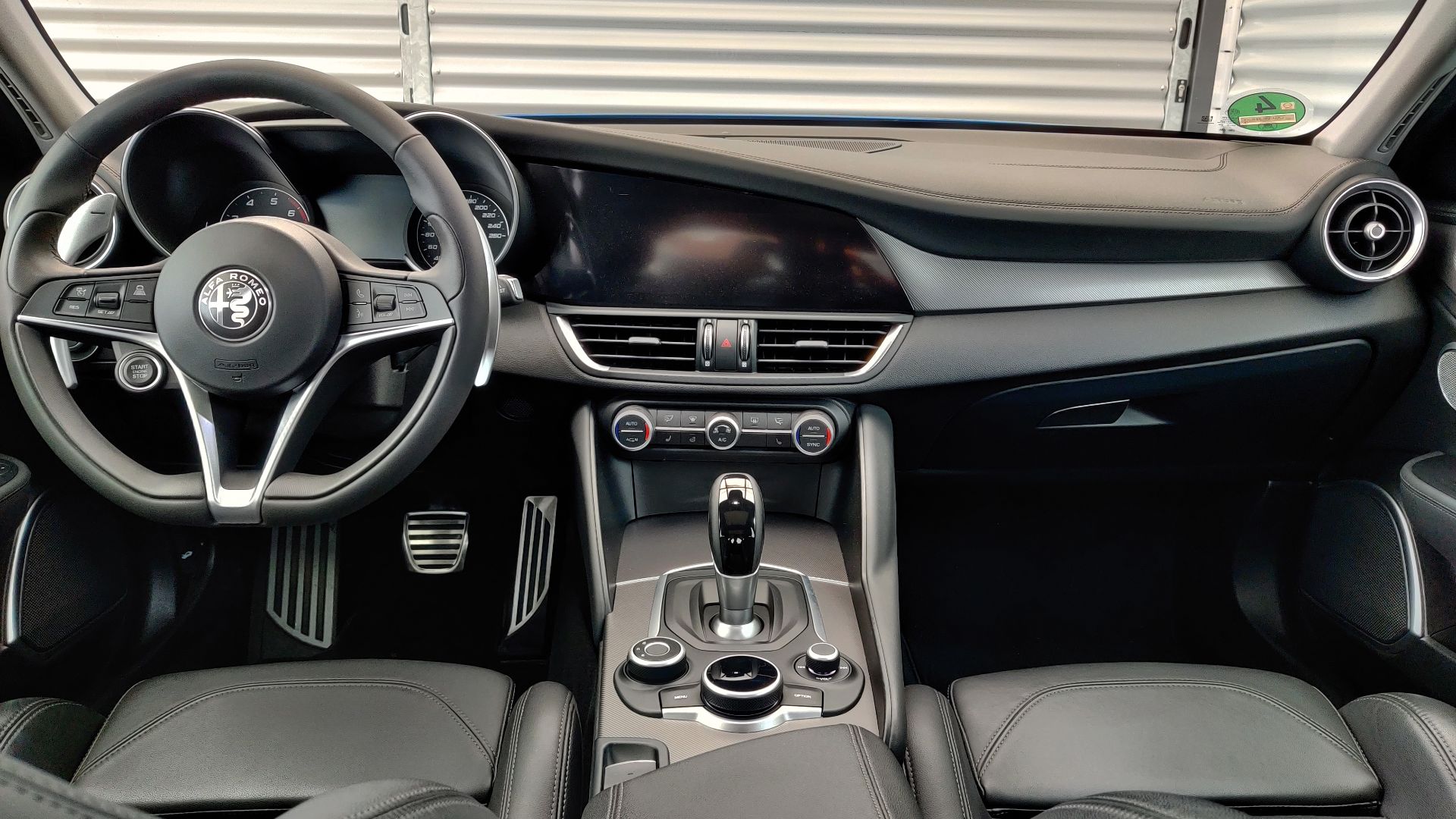
7. Alfa Romeo
Romance and racing fuel Alfa Romeo's identity, but their logo evolution reveals practical adaptations beneath the passion. The removal of "Milano" in 1972 marked their expansion beyond the city limits, while the 2015 restructuring simplified the serpent and cross into cleaner, more contemporary forms.
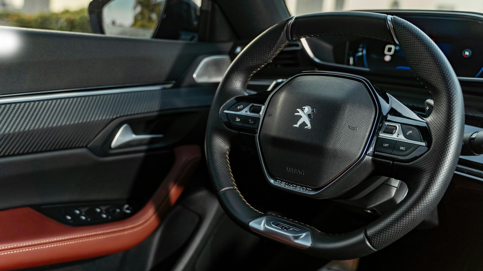
8. Peugeot
France's lion-hearted automaker made headlines in 2021 with what experts called “one of the most spectacular brand redesigns ever.” The move to a fierce lion's head profile signals Peugeot's luxury market ambitions. The new shield-shaped layout deliberately echoes premium brands like Porsche and Maserati.
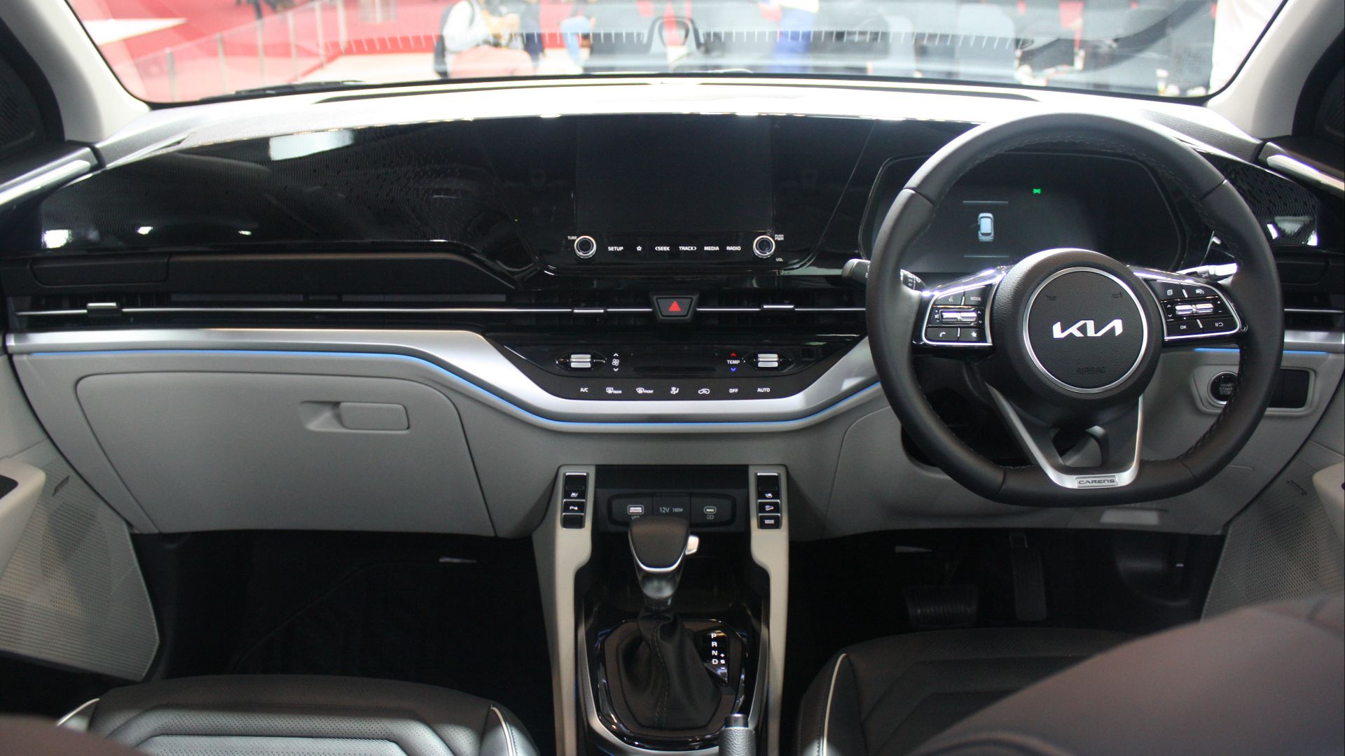
9. Kia
Kia's 2021 logo remake caused massive confusion—30,000 monthly Google searches for "KN car" prove people can't read the stylized "IA" connection. The transition to this controversial script resulted in a documented 27% drop in brand recognition, making it automotive history's most problematic rebrand.
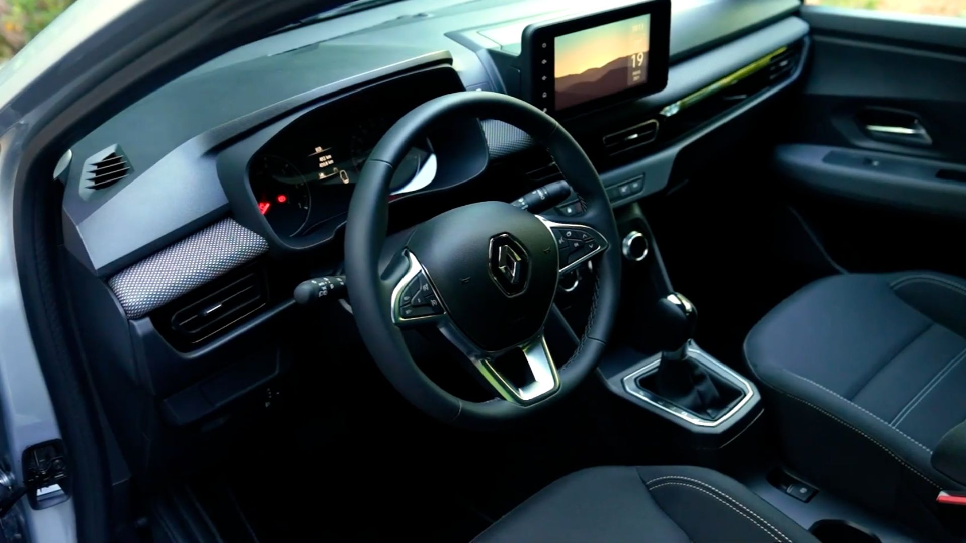
10. Renault
The diamond returns, but not as you remember it. Renault's 2021 logo revival reaches back to 1972 for inspiration, proving that sometimes moving forward means looking backward. The new look strips away the three-dimensional effects and metallic finishes that defined recent decades.
Now, it's time to meet the brands that have guarded their original designs, maintaining their visual identity with devotion.
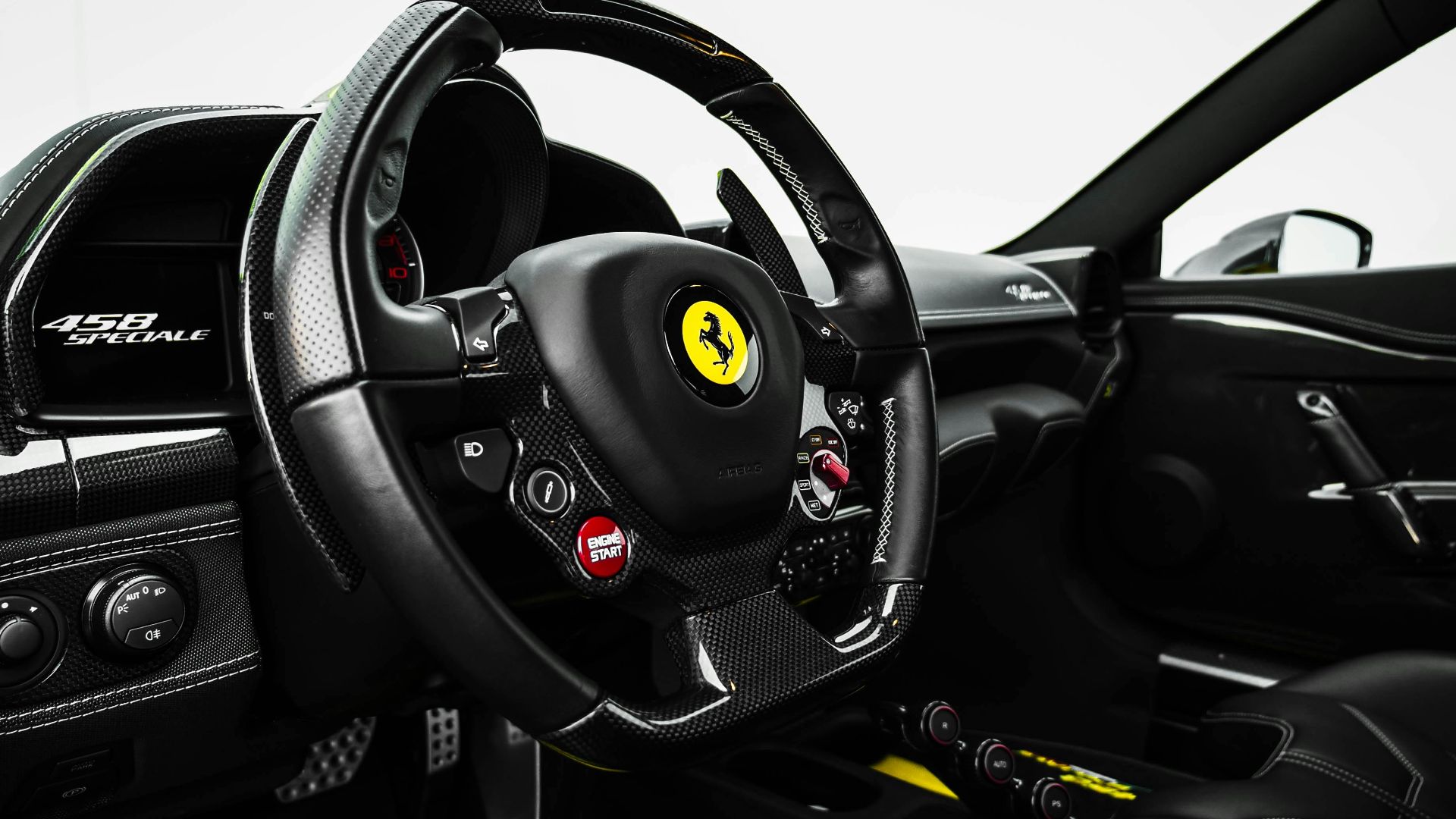
1. Ferrari
Since 1932, Ferrari's prancing horse has galloped virtually unchanged across nearly a century. The yellow shield background, Italian flag colors, and iconic black stallion remain identical to Enzo Ferrari's original pattern. While minor refinements touched line thickness and proportions, the core elements never wavered.
2. Mercedes-Benz
The three-pointed star achieved perfection in 1933 and refused to budge. Representing land, sea, and air dominance, Mercedes-Benz's circular symbol underwent only mild dimensional adjustments. It has maintained its symbolism and global recognition as a mark of luxury and engineering excellence.

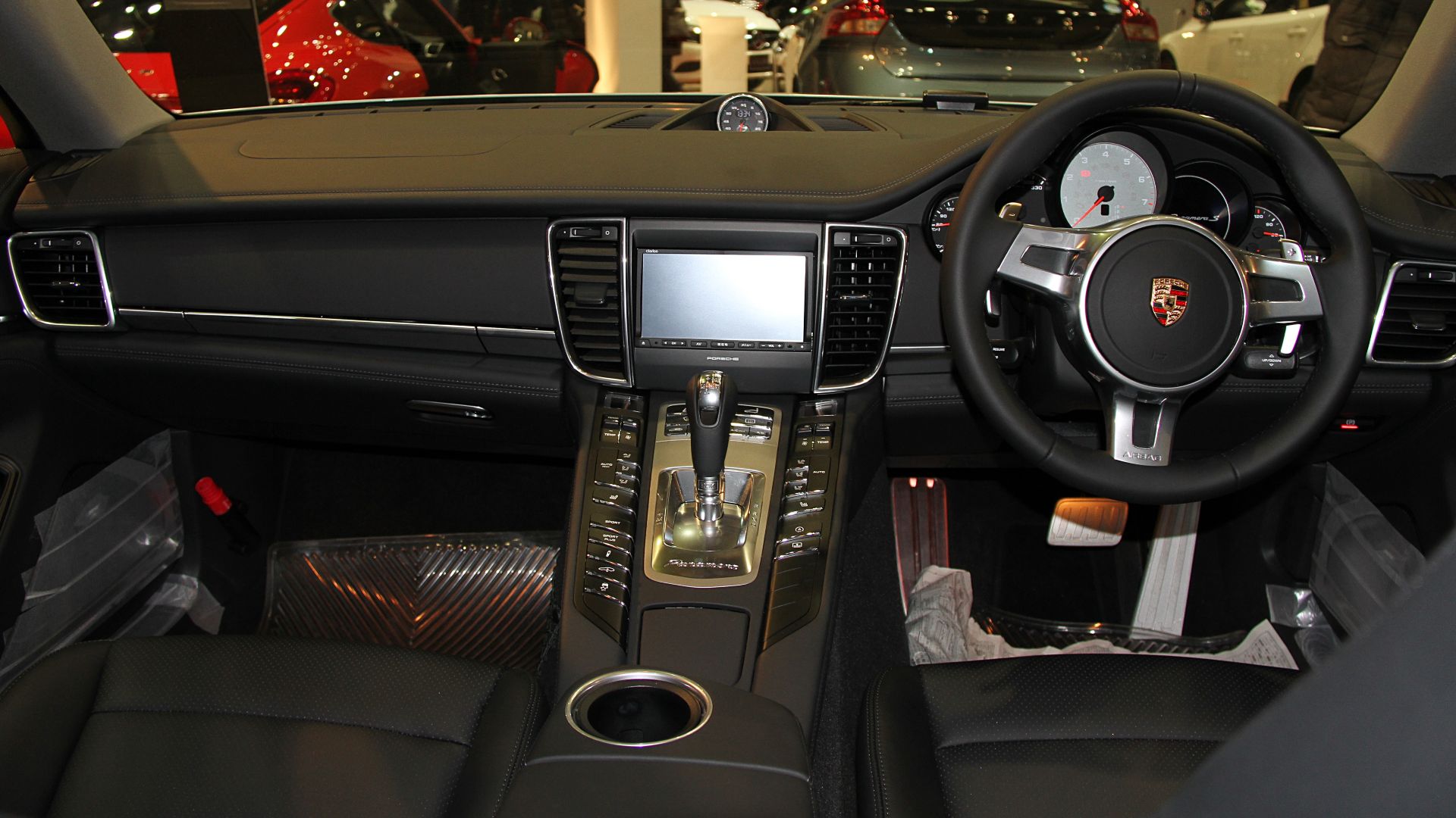
3. Porsche
Stuttgart's coat of arms became Porsche's permanent identity in 1952 with the 356 model. The heraldic design featuring Württemberg's colors and Stuttgart's prancing horse has stayed unchanged for over 70 years. This honors the founder Ferdinand Porsche's respect for traditional German automotive craftsmanship.
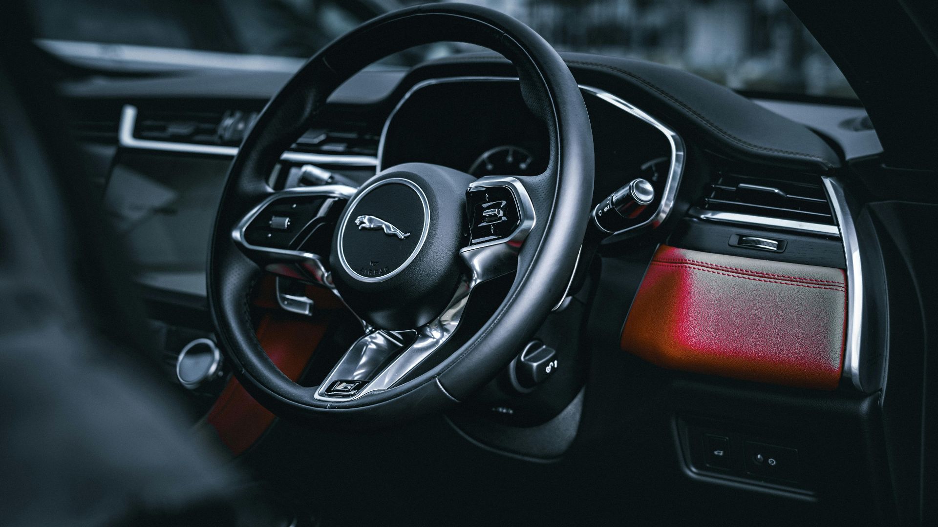
4. Jaguar
The leaping cat has defined the Jaguar since the 1930s, retaining its essential form through ownership and market changes. While grille presentations moved from jumping to roaring jaguar heads in recent years, the original feline imagery has never abandoned its British luxury positioning.
5. Ford
Henry Ford's signature in a blue oval achieved iconic status in 1927. In the 1960s, designer Paul Rand was commissioned to create a radical redesign. Still, Henry Ford II rejected it, keeping the traditional blue oval logo due to its substantial brand equity.

6. Chevrolet
The bowtie mystery began in 1913 and continues today—nobody knows its true origin, but everyone recognizes its power. Despite countless theories about wallpaper patterns or Swiss crosses, Chevrolet's badge survived the Great Depression and world wars. While colors changed, the basic cross shape stayed.

7. Jeep
Military origins shaped Jeep's no-nonsense identity in the 1940s. The simple "Jeep" wordmark in Helvetica bold font survived corporate ownership changes from Willys to Kaiser to AMC to Chrysler to Stellantis. This grille structure often replaces the need for the word "Jeep" on vehicles.

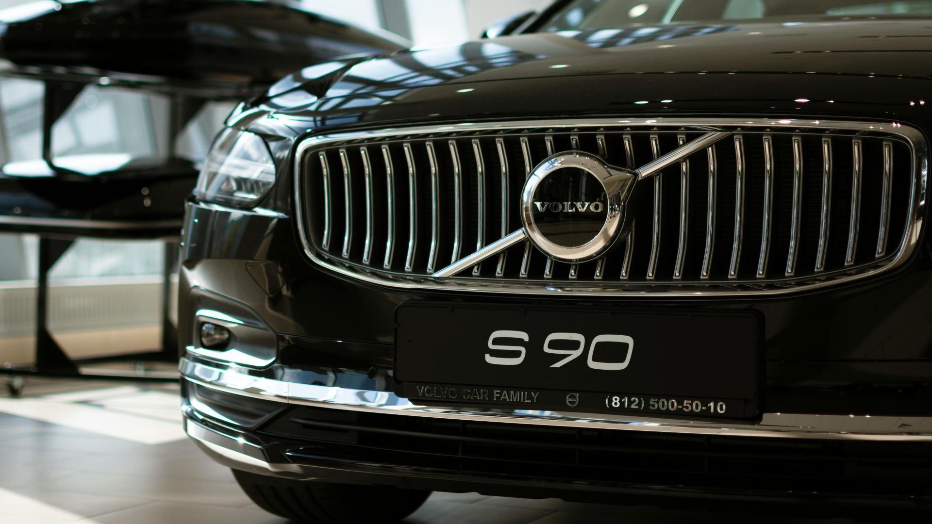
8. Volvo
Sweden's safety-first automaker quietly updated its logo in 2021, but the changes were so minimal that they proved the design's enduring strength. The iron symbol representing Swedish steel heritage carried forward its circular form and diagonal arrow for decades, highlighting Volvo's commitment to Scandinavian design principles.
9. Subaru
Since it was created in 1953, the Subaru logo has mostly stayed the same in its essential components. Six stars with four points are always visible, arranged in an oval shape, one larger star and five smaller ones. This styling symbolizes the Pleiades star cluster.

10. Honda
The simple "H" in a trapezoidal frame debuted in 1963. Representing founder Soichiro Honda's confidence and the company's engineering excellence, this geometric perfection survived Honda's expansion from motorcycles to cars to aviation. The first significant redesign of a new “H” is planned for future EVs.