
Logo Vs. No-go
A car logo will tell a story well before the engine even starts. Some whisper tales of heritage and craftsmanship that make your heart race just looking at them. Others? Well, they're basically automotive white noise. The difference between memorable and mundane often comes down to whether designers understand that a badge is more than just a brand marker. Let's begin by looking at the 10 most boring logos to have ever existed.
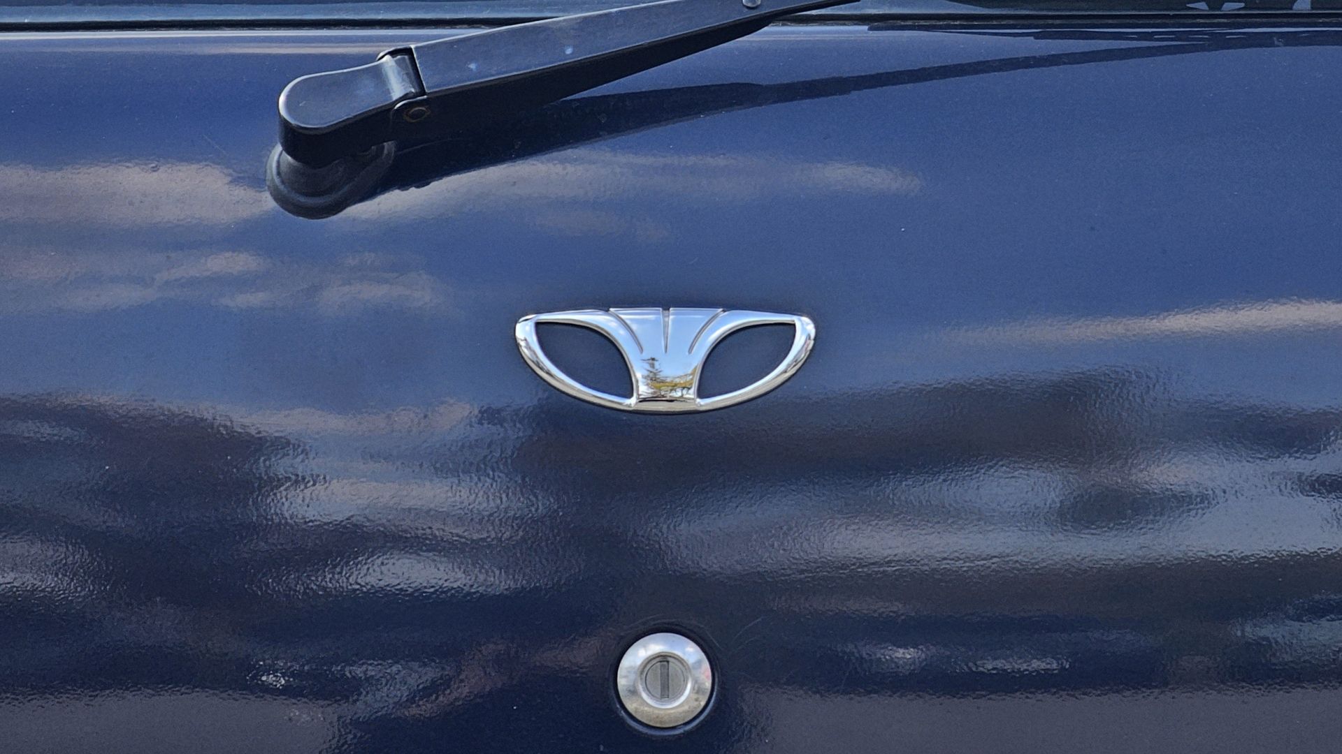
1. Daewoo
Back in the 1990s, when South Korean automaker Daewoo was attempting to crack Western markets, their biggest enemy wasn't Toyota or Honda—it was their own logo. It's just the company name trapped inside a rectangular border with basic typography that screams "we gave up."
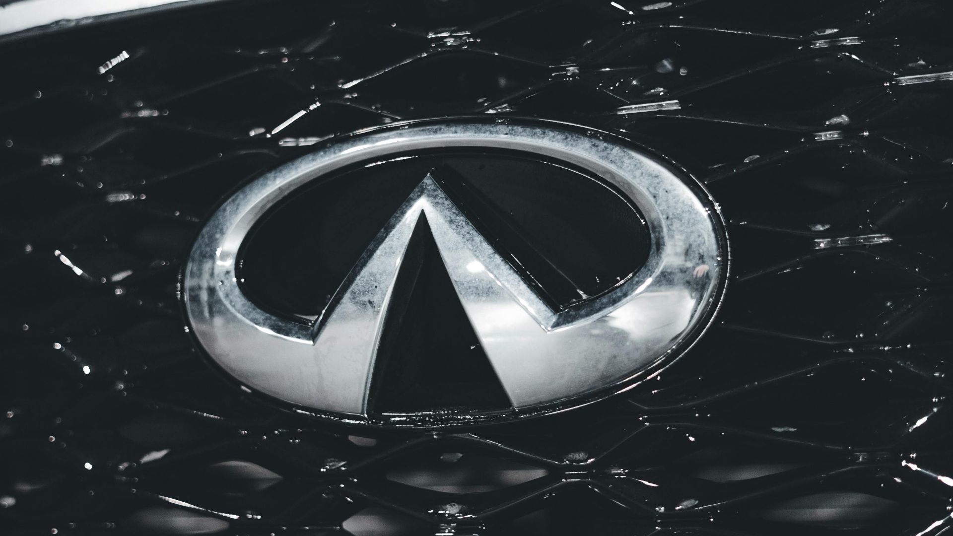
2. Infiniti
The Infiniti car logo is often described as a symbol of an "infinite road" leading to a horizon, inspired by the brand's name and representing infinite possibilities or an endless journey. The existing design has remained consistent since the brand's creation in the 1980s.
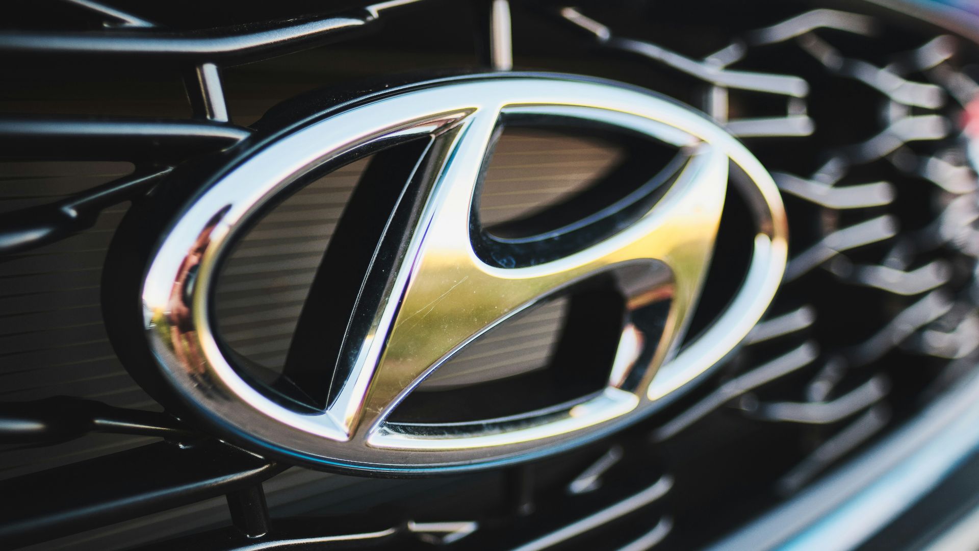
3. Hyundai
Well, the cosmic joke of automotive emblems has to be Hyundai's slanted 'H'. This one is so unremarkable that millions of drivers regularly confuse it with Honda's similarly generic 'H' emblem. The italicized letter was supposed to represent two people shaking hands.
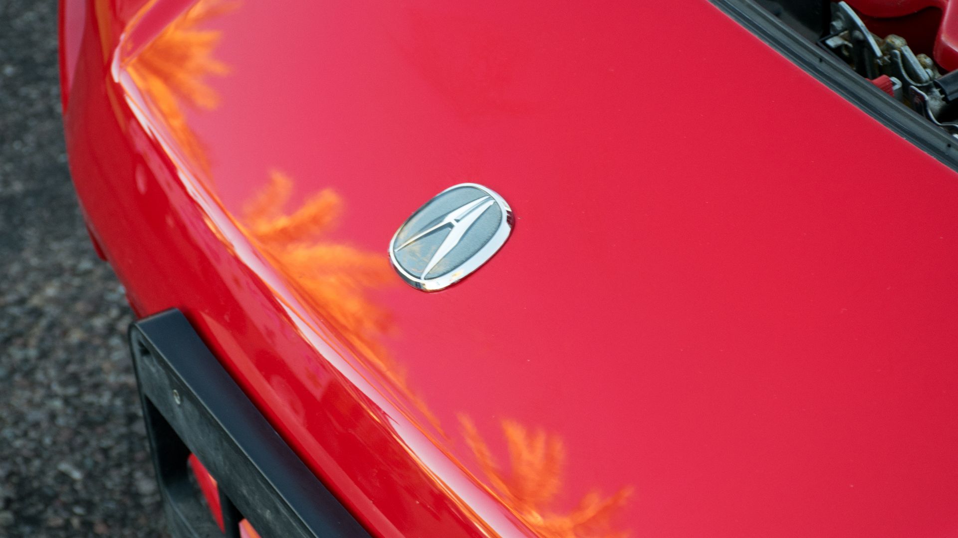
4. Acura
This logo, introduced in 1986, is inspired by a caliper, a tool used by engineers for precise measurements. It symbolizes Acura’s commitment to precision, engineering excellence, and performance. Over the years, the logo has undergone refinements to streamline its appearance.
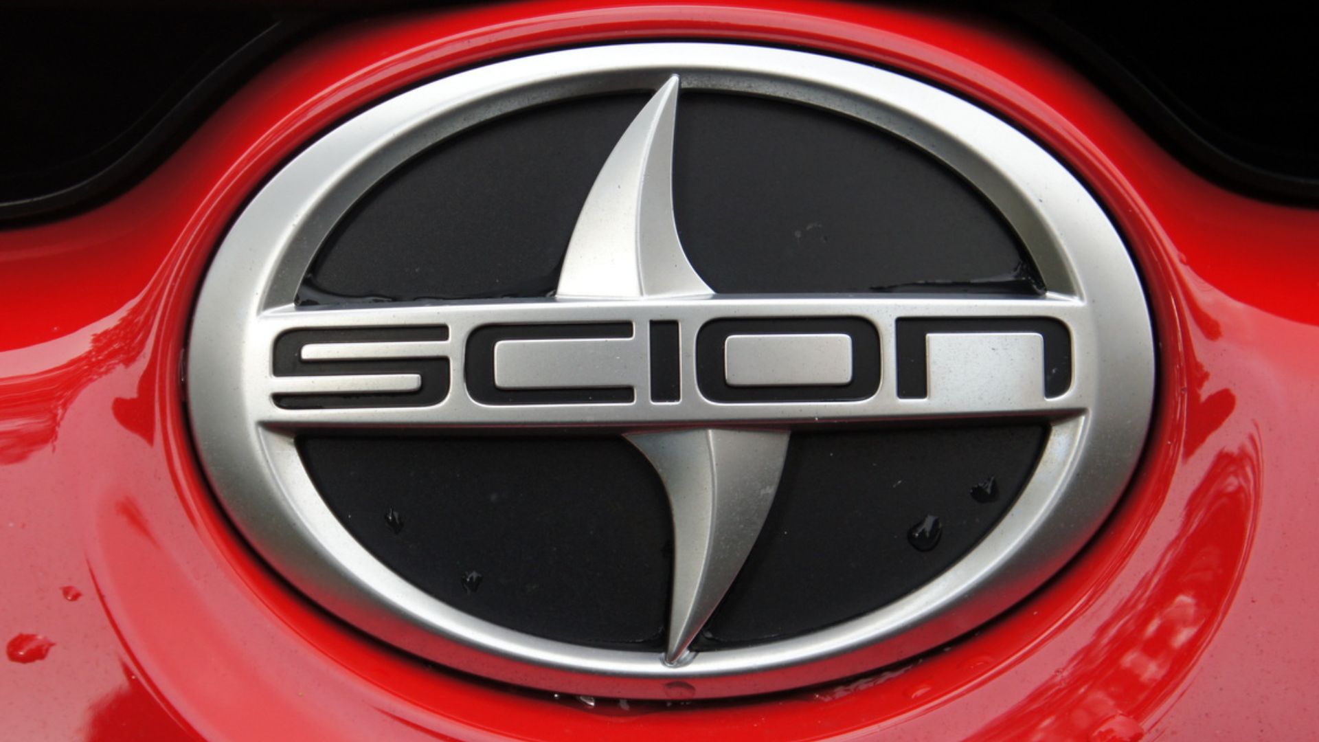
5. Scion
Scion invested heavily in branding to attract younger buyers. Still, its logo—a stylized ‘S’ in a circle—was criticized as forgettable, blending into the crowded automotive market without leaving a strong impression. Market research revealed that Scion's visual identity repelled the young demographic.
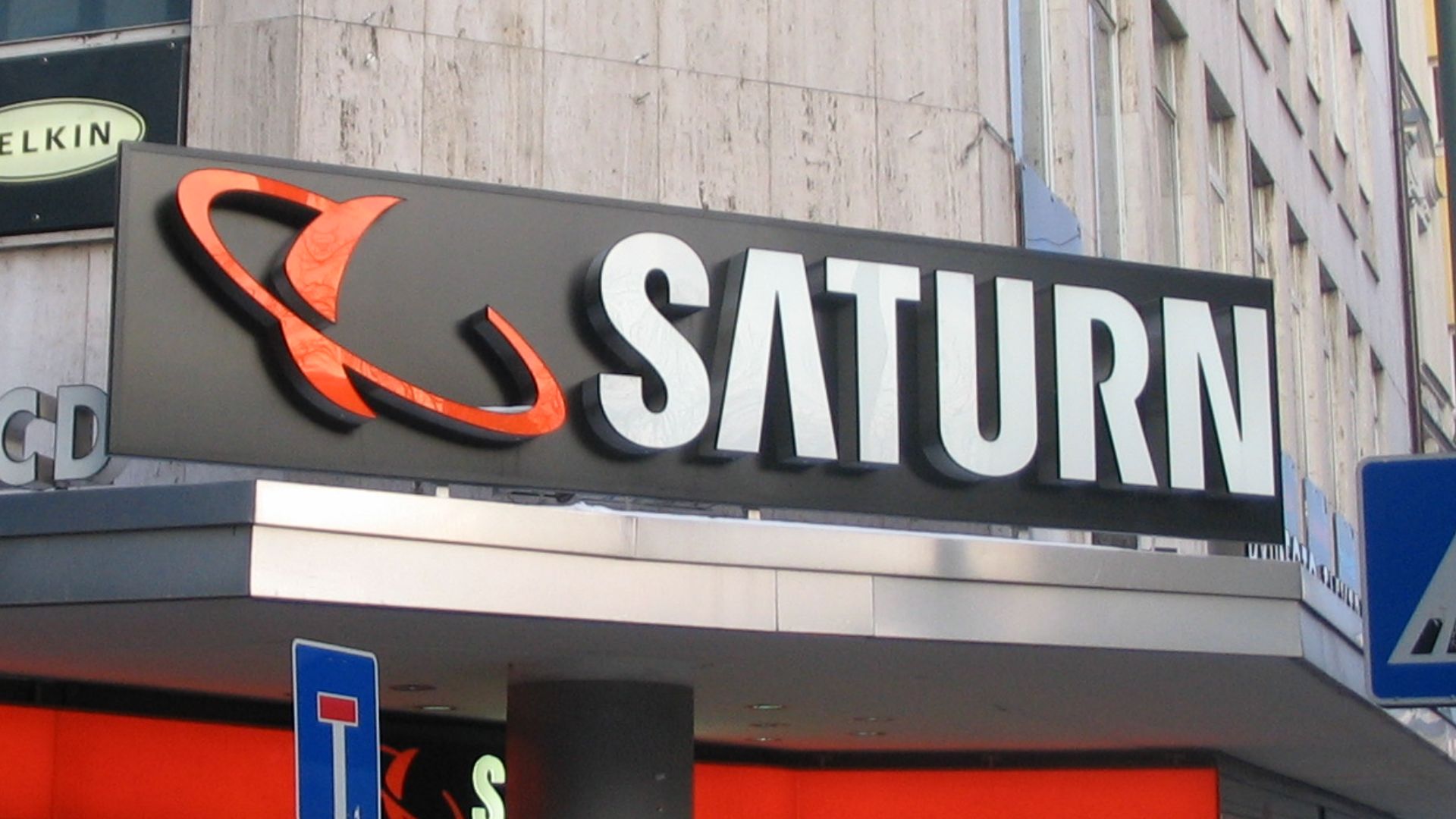
6. Saturn
The Saturn car emblem was created in the mid-1980s and mostly remained unchanged until the brand's discontinuation in 2010. It is a minimalist, contemporary representation of the planet Saturn, depicted by two smooth, silver curves that mimic the planet's shape and orbit.
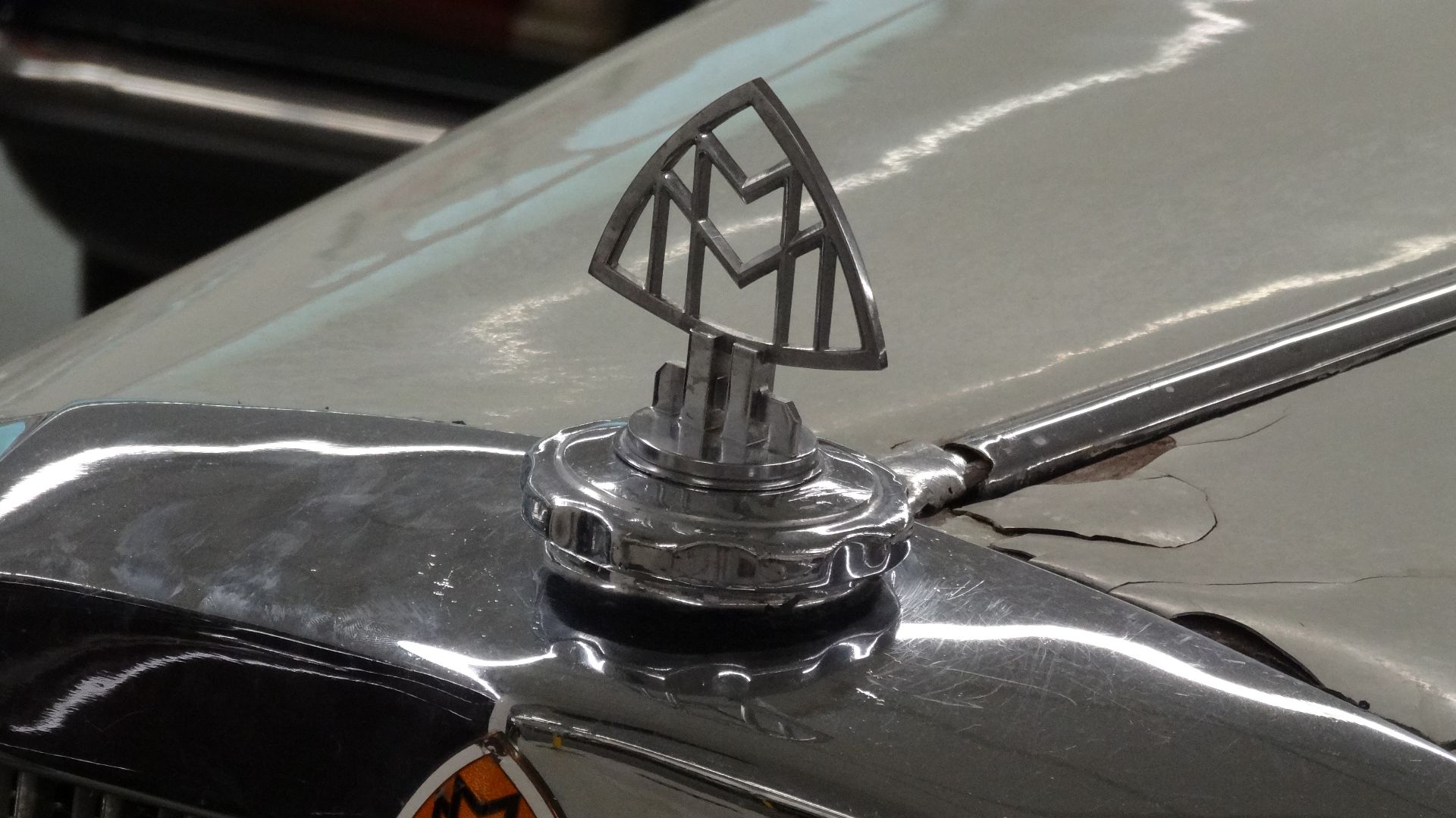
7. Maybach
Ultra-luxury vehicles demand ultra-premium logos, which makes Maybach's interlocking 'MM' monogram particularly baffling. Despite price tags exceeding $200,000, this ultra-luxury sub-brand under Mercedes chose typography that belongs on personalized napkins rather than the world's most expensive sedans.
 Klaus Nahr from Germany on Wikimedia
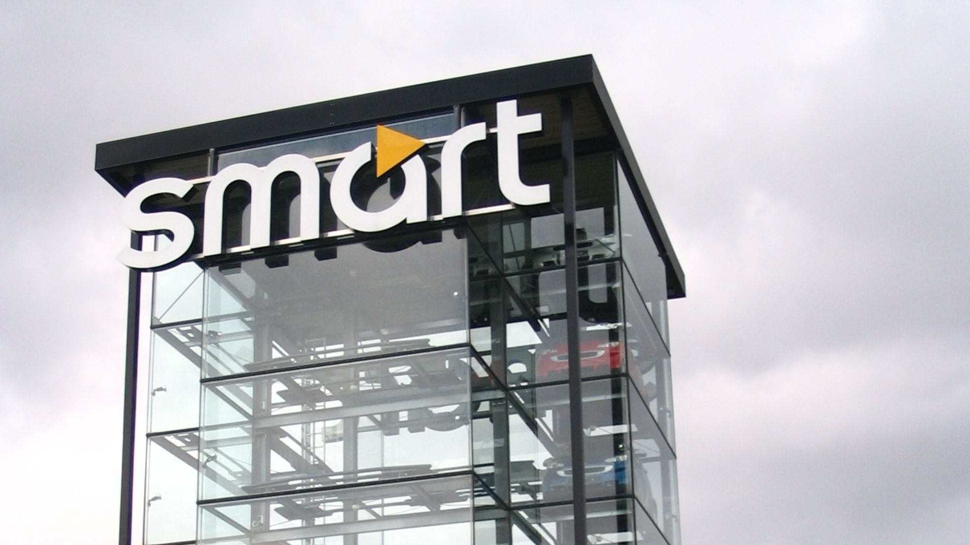
8. Smart
The tech startup aesthetic completely backfired when Mercedes-Benz applied it to its Smart city car logo. This lowercase wordmark with a tiny arrow looks more suited for email signatures than automotive badges. It created an identity crisis for a brand trying to suggest urban sophistication.
9. Geo
Geometric shapes can be powerful branding tools, but Geo's globe-like emblem with a grid pattern was considered somewhat bland and uninspiring, fitting into the "boring" category. This General Motors import division used one of mathematics' highly fundamental shapes and somehow drained it of all personality.
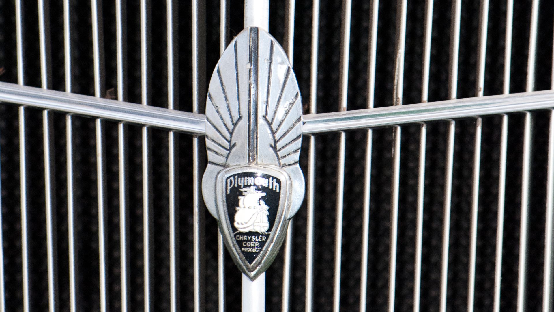
10. Plymouth
Plymouth’s well-known Mayflower ship logo, chosen for its historical tie to the Pilgrim ship, was criticized as overly simplistic. While the Pilgrim connection was factually correct and culturally significant, the resulting logo resembled the clip art found in elementary school textbooks.
But then there are the badges that got everything right.
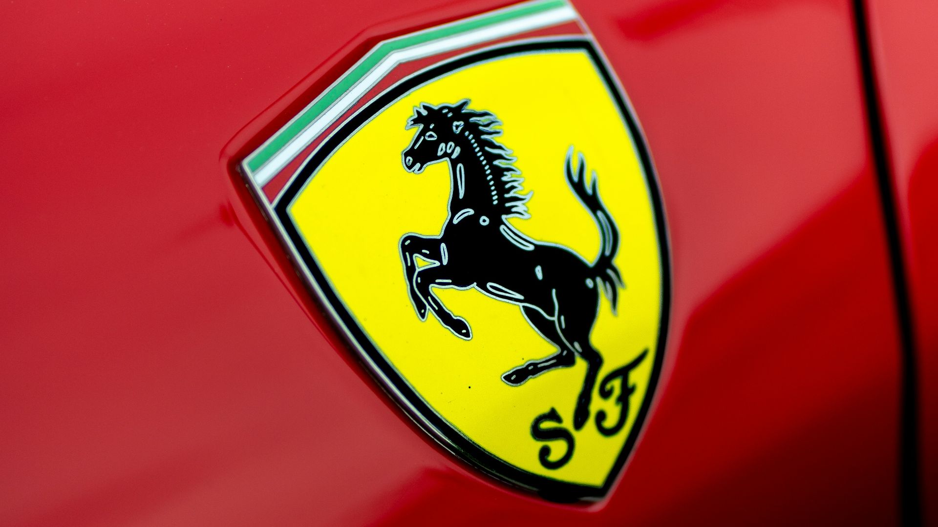
1. Ferrari
Those yellow shields adorning Ferraris worldwide carry the spirit of a dead WWI flying ace. Francesco Baracca painted this black stallion on his fighter plane before dying in aerial combat, and his grief-stricken mother later suggested that Enzo Ferrari adopt the symbol.
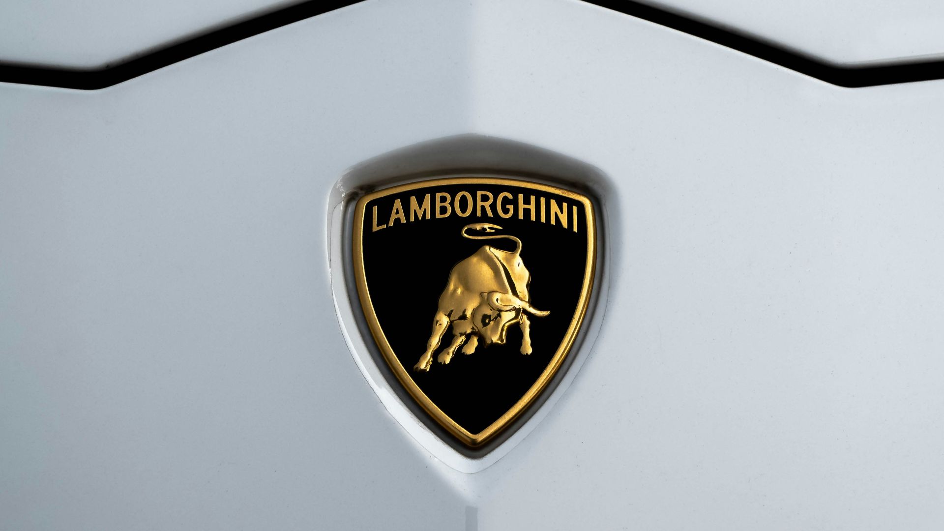
2. Lamborghini
Ferruccio Lamborghini's zodiac sign literally charges across every machine bearing his name. Born under Taurus, this former tractor manufacturer chose the raging bull specifically to antagonize Enzo Ferrari's prancing horse. This was the most expensive zodiac rivalry in automotive history.
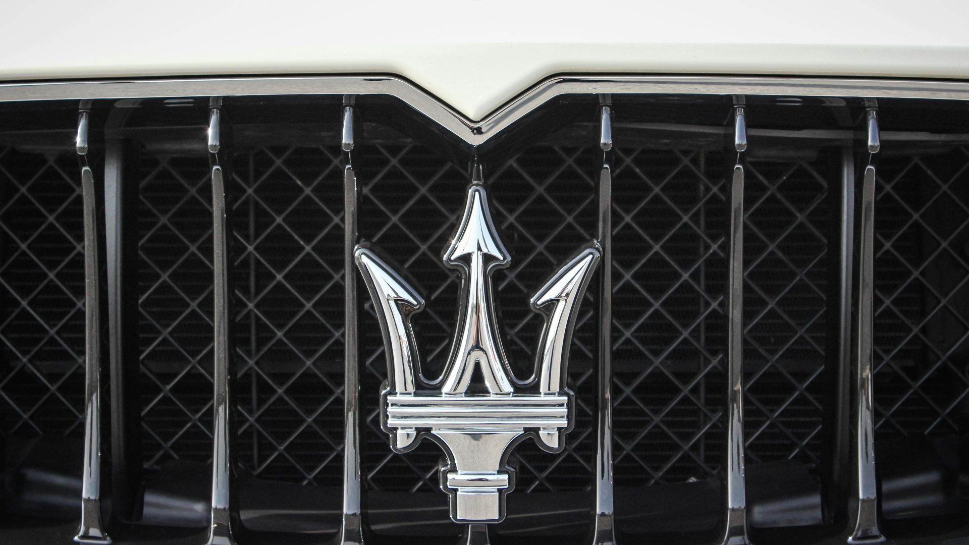
3. Maserati
The upward-pointing prongs weren't accidental—they deliberately suggest aspiration and rising power, while the red, blue, and silver colors create Italy's most intriguing interpretation of patriotic car branding. Bologna's ancient Fountain of Neptune provided the weapon that would conquer luxury automotive markets throughout.
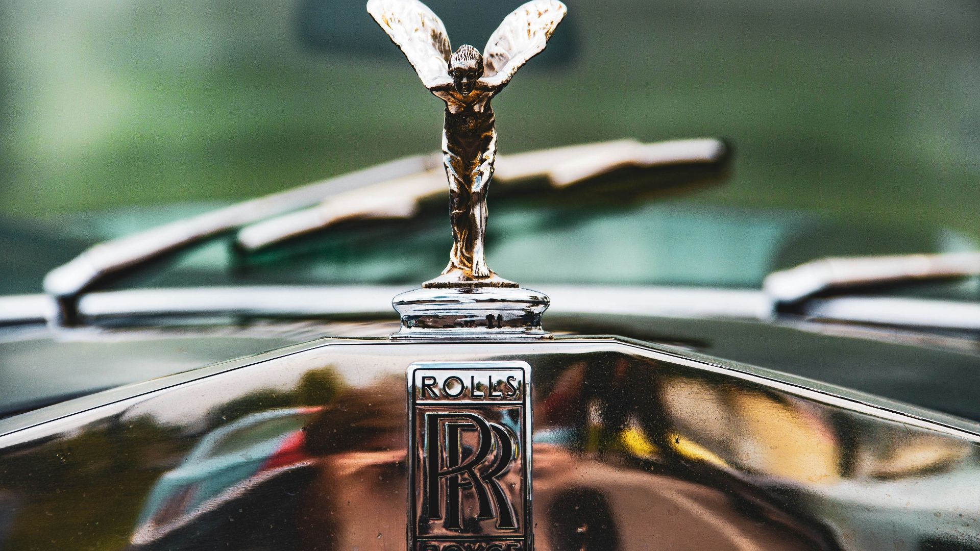
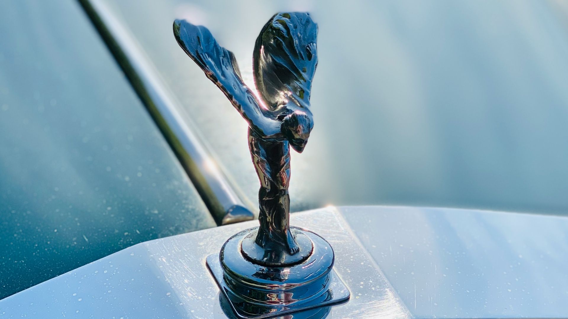
4. Rolls-Royce
Eleanor Thornton, a secretary to early Rolls-Royce enthusiast Lord Montagu, became immortalized as the model for the Spirit of Ecstasy bonnet mascot in 1911. She posed for sculptor Charles Sykes, who crafted the emblem to capture the essence of luxurious flight.
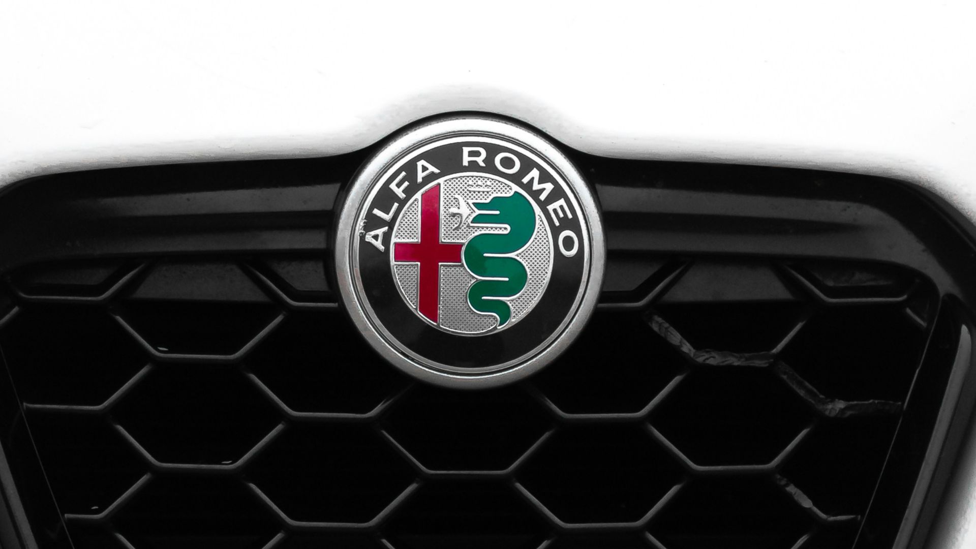
5. Alfa Romeo
This is where Milan's red cross meets the Visconti serpent devouring a Saracen warrior. The circular badge's left side features the Saint George's cross, representing Milan. In contrast, the right side displays an ancient noble family crest dating back to the First Crusade.
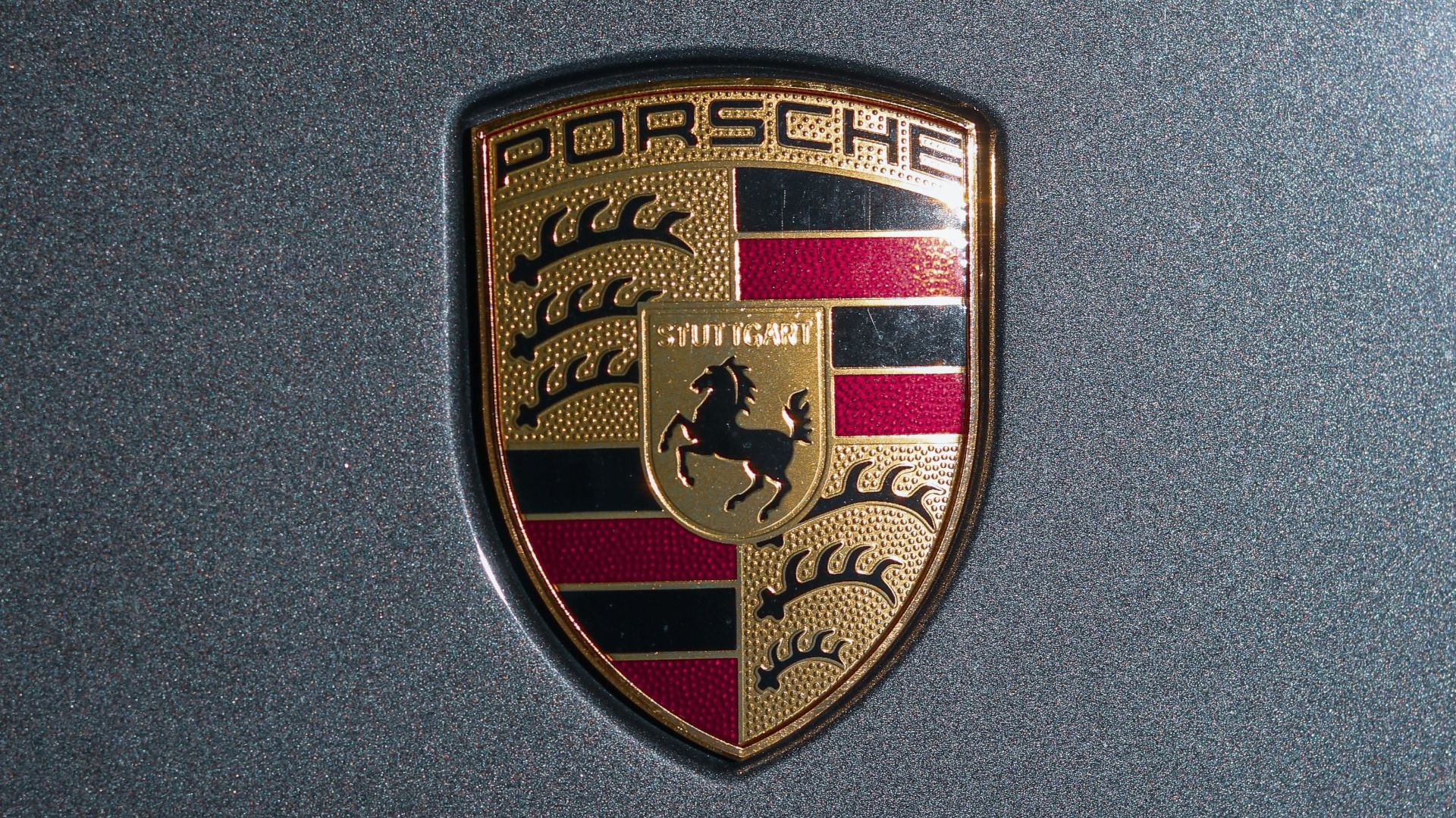
6. Porsche
That rearing horse in the center represents Stuttgart's original name, "Stutengarten," meaning mare's garden. It is said that the surrounding red and black stripes pay tribute to Württemberg's royal heraldic traditions. This wasn't marketing committee nonsense—it was genuine regional pride.
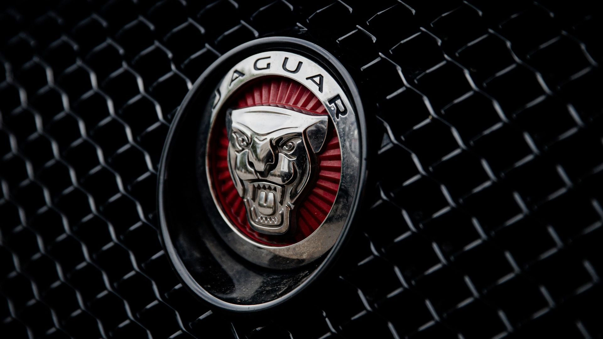
7. Jaguar
Gordon Crosby's leaping jaguar captured feline grace in metallic form years before the Jaguar name even existed. It was initially structured in 1935 for SS Cars. The sculptor studied big cats extensively, ensuring every muscle and sinew suggested forward motion even when stationary.
 LOGAN WEAVER | @LGNWVR on Unsplash
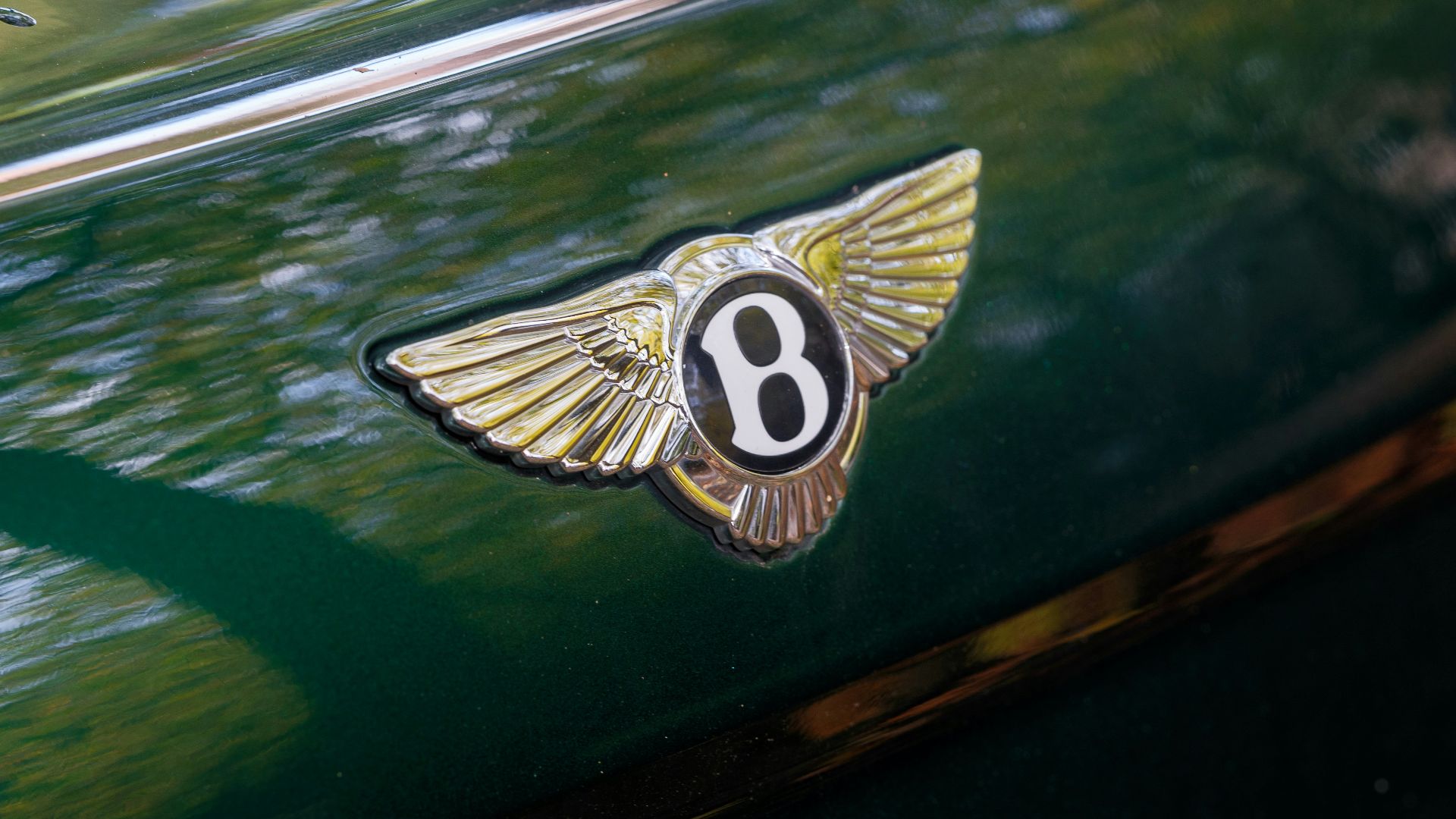
8. Bentley
Aviation fascination drove Walter Owen Bentley's winged emblem design, perfectly balancing luxury sophistication with dynamic flight symbolism that mirrors his obsession with early speed records. The wings suggest freedom and velocity. Then comes the central 'B,' which maintains typographic elegance.
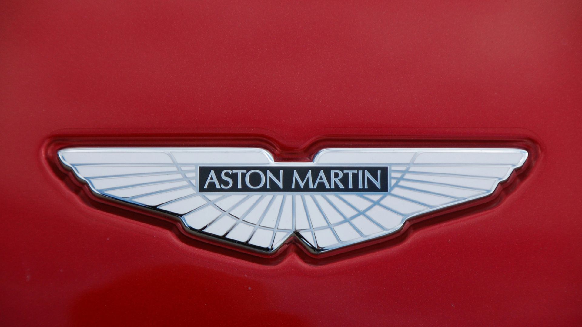
9. Aston Martin
Founded near Aston Hill by Lionel Martin, the name itself talks about the grassroots racing origins that evolved into the sophistication of James Bond through decades of motorsport excellence. Those carefully proportioned wings suggest both speed and exclusivity without appearing ostentatious.
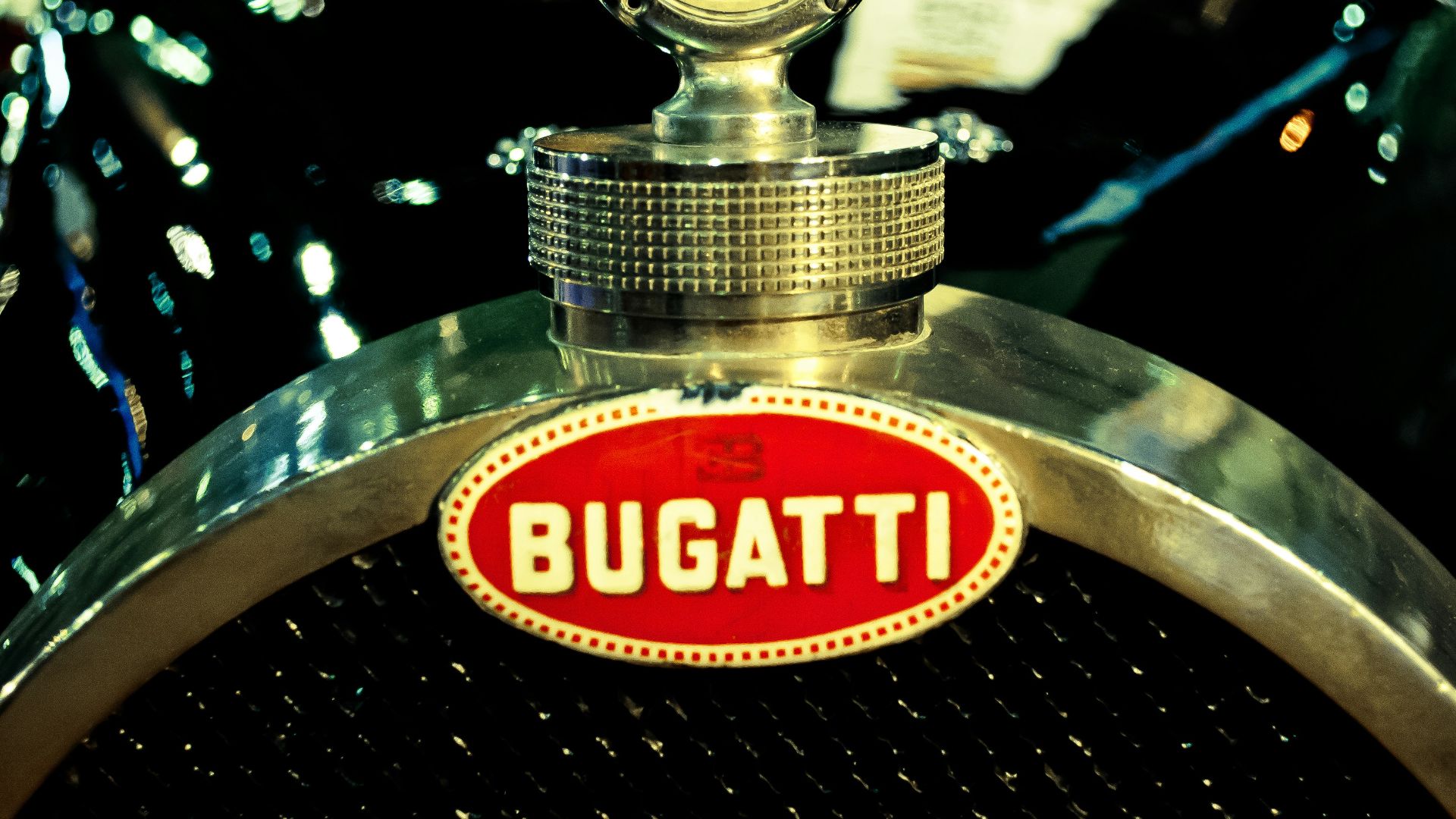
10. Bugatti
French luxury jewelry techniques inspired Bugatti's oval badge design. Pearl-like dots border Ettore Bugatti's refined initials in this gorgeous monogram. The red lettering on pristine white background highlights old-world craftsmanship and attention to detail that extends from logo design into every mechanical component.